In today's digital landscape, your website's visual identity can make or break your online presence. Website design styles are more than just aesthetic choices—they're strategic decisions that communicate your brand's values, build trust with your audience, and ultimately drive conversions. Whether you're launching a new business or refreshing an existing digital presence, understanding the various website design styles available will help you create a cohesive online experience that resonates with your target market.
The right design style doesn't just look good; it aligns with your brand identity, meets user expectations, and supports your business objectives. From the clean simplicity of minimalist design to the bold rebellion of brutalism, each style serves different purposes and appeals to different audiences. This comprehensive guide will walk you through the most popular website design styles, helping you identify which aesthetic best represents your brand and connects with your customers.
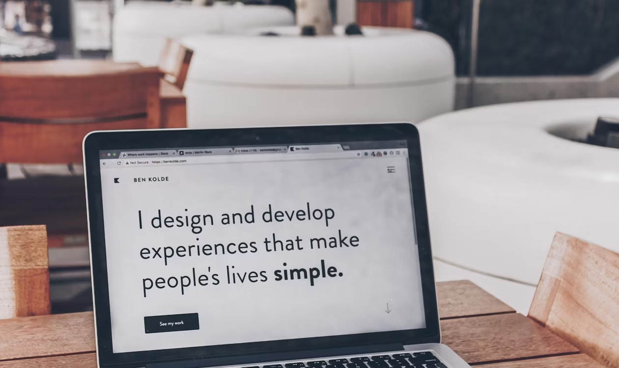
Minimalist Design: The Power of Less is More
Minimalist design has dominated the digital landscape for good reason. This approach strips away unnecessary elements, focusing attention on what truly matters. Characterized by generous white space, limited color palettes, clean typography, and purposeful simplicity, minimalist websites create breathing room that allows content and calls-to-action to shine.
Brands like Apple have perfected this approach, using minimalism to communicate sophistication and premium quality. Their website features crisp product photography against white backgrounds, minimal text, and intuitive navigation. This design language extends their physical product design philosophy into the digital realm, creating consistency across all brand touchpoints.
When Minimalism Works Best
Minimalist website design styles excel in industries where the product or service needs to be the hero. Luxury brands, technology companies, and professional services firms often benefit from this approach. The simplicity conveys confidence—the brand doesn't need flashy elements to grab attention because the offering speaks for itself.
However, minimalism requires discipline. Every element must earn its place on the page. This means exceptional photography, carefully crafted copy, and strategic use of white space to guide the user's eye through the intended journey.
Material Design: Google's Comprehensive Design Language
Material Design, introduced by Google in 2014, brought a systematic approach to digital design. This style combines the classic principles of good design with technological innovation, using subtle shadows, layered elements, and responsive animations to create depth and hierarchy on flat screens.
The key principle behind Material Design is creating a visual language that synthesizes the metaphor of physical materials (paper and ink) with technological capabilities. Elements cast shadows, respond to touch with ripple effects, and move in physically realistic ways. This creates interfaces that feel intuitive because they behave like objects in the real world.
Material Design Implementation
Google's own properties showcase Material Design at its finest, but many other brands have adopted this style. The approach provides comprehensive guidelines for everything from color selection to animation timing, making it easier for teams to create consistent experiences across platforms.
This design style works particularly well for applications and platforms with complex functionality. The systematic approach helps users understand relationships between different interface elements and navigate sophisticated systems with confidence.
Flat Design 2.0: Evolution of Digital Aesthetics
Flat Design 2.0 represents the maturation of the original flat design movement. While early flat design completely eliminated depth cues, creating occasionally confusing interfaces, the evolved version adds subtle shadows, gradients, and depth to improve usability while maintaining the clean, modern aesthetic.
Stripe exemplifies this approach beautifully. Their website uses gradient backgrounds, subtle shadows on cards, and gentle animations that add dimension without the heavy skeuomorphism of earlier design eras. The result feels modern and approachable while maintaining excellent usability.
Balancing Aesthetics and Usability
The key to successful Flat Design 2.0 is finding the sweet spot between visual simplicity and functional clarity. Buttons should look clickable, cards should appear distinct from backgrounds, and interactive elements should provide clear affordance—all without reverting to outdated visual styles.
This website design style particularly appeals to tech-forward brands that want to communicate innovation and modernity. SaaS companies, fintech startups, and digital agencies frequently adopt this approach to signal their contemporary mindset.
Brutalism: Bold Typography and Raw Aesthetics
Brutalist web design takes inspiration from Brutalist architecture, embracing raw, unpolished aesthetics that challenge conventional beauty standards. Characterized by bold typography, stark contrasts, unconventional layouts, and intentionally rough edges, brutalism makes a strong statement.
This style deliberately breaks design rules that others follow religiously. Brutalist websites might use clashing colors, asymmetrical layouts, exposed HTML elements, or unconventional navigation patterns. The approach communicates authenticity, rebellion, and artistic confidence.
Strategic Brutalism
While brutalism might seem chaotic, the best examples are carefully orchestrated. Creative agencies, artists, and fashion brands sometimes adopt this style to differentiate themselves and showcase their avant-garde thinking. The key is ensuring that the unconventional design still supports the user's goals—brutalism shouldn't sacrifice usability for shock value.
However, this design style isn't for everyone. Conservative industries or brands targeting risk-averse audiences should probably look elsewhere. Brutalism works best when the target audience appreciates bold creativity and when the brand has the confidence to polarize opinion.
Corporate Professional: Building Trust Through Design
Corporate professional website design styles prioritize credibility, trust, and clarity. These sites typically feature conservative color schemes (often blues and grays), structured layouts, professional photography, and clear information hierarchy. The goal is to communicate stability, expertise, and reliability.
Financial institutions, legal firms, healthcare providers, and B2B enterprises often adopt this approach. Companies like JPMorgan Chase or Deloitte use professional design to reinforce their expertise and trustworthiness. The design might not win creativity awards, but it effectively communicates the brand's core values.
Modern Corporate Design
Contemporary corporate design has evolved beyond the stodgy, template-driven websites of the past. Modern professional sites maintain credibility while incorporating contemporary design elements—better typography, subtle animations, and improved user experience. The challenge is appearing current without sacrificing the professional gravitas that industries like finance and law require.
This style benefits from generous use of white space, clear calls-to-action, and strong information architecture. The content should be scannable, with clear headings and logical flow that helps users quickly find the information they need.
Creative Portfolio: Visual Storytelling for Showcasing Work
Portfolio websites for creative professionals require design styles that showcase work without overshadowing it. These sites often feature large imagery, dynamic layouts, smooth scrolling effects, and minimal navigation that keeps focus on the portfolio pieces themselves.
Designers, photographers, architects, and creative agencies need websites that demonstrate their capabilities through the site itself. The website becomes a portfolio piece in its own right, showcasing the creator's aesthetic sensibility and technical skills.
Balancing Showcase and Usability
The best creative portfolio websites balance visual impact with functional clarity. While beautiful transitions and innovative layouts demonstrate creativity, users still need intuitive navigation and fast load times. The design should enhance the work being presented, not compete with it for attention.
Many creative portfolio sites use grid-based layouts with generous imagery, allowing the work to speak loudly while maintaining organizational structure. Others opt for more experimental approaches, using parallax scrolling, unconventional navigation, or interactive elements that create memorable experiences.
E-commerce Modern: Conversion-Optimized Product Design
Modern e-commerce website design styles focus relentlessly on conversion optimization while creating enjoyable shopping experiences. These sites feature prominent product imagery, clear pricing, streamlined checkout processes, and trust-building elements like reviews and security badges.
Companies like Allbirds or Glossier have redefined e-commerce design with clean, minimalist approaches that prioritize product photography and user-generated content. Their sites feel less like traditional online stores and more like carefully curated brand experiences.
E-commerce Design Principles
Successful e-commerce design removes friction from the buying process. This means fast load times, mobile-optimized layouts, clear product categorization, and persistent shopping cart access. The design should build confidence through professional photography, detailed product information, and transparent policies.
This website design style also incorporates psychological triggers—scarcity indicators, social proof, and strategic use of color to highlight calls-to-action. Every element serves the ultimate goal of converting browsers into buyers while creating positive brand associations that encourage repeat purchases.
Magazine and Blog Style: Content-Heavy, Readable Design
Magazine-style websites prioritize content readability and discovery. These sites feature strong typography, card-based layouts, prominent featured images, and sophisticated content categorization. The design facilitates content consumption while helping users discover related articles.
Publications like Medium have popularized this approach with ultra-clean typography and distraction-free reading experiences. The design gets out of the way, letting the content shine while providing subtle navigation and discovery features.
Content-Focused Design Elements
Magazine website design styles require careful attention to typography—appropriate font sizes, line spacing, and line length that optimize readability. These sites often use a content hierarchy that highlights important or trending articles while providing clear pathways to archived content.
Effective magazine designs balance content density with white space, ensuring pages feel full without overwhelming users. Strategic use of imagery breaks up text, while consistent formatting creates familiarity that helps readers navigate large content libraries.
Landing Page Focused: Single-Page Conversion Design
Landing page design represents a specialized approach focused entirely on conversion. These sites typically use a single-page layout with strategic sections that guide users through a narrative journey toward a specific action—signing up, purchasing, or downloading.
Successful landing pages use strong headlines, benefit-focused copy, compelling visuals, social proof elements, and prominent calls-to-action. The design creates a linear story that addresses objections and builds desire as users scroll.
Landing Page Design Strategy
This website design style works particularly well for product launches, event registrations, or lead generation campaigns. The focused nature eliminates distraction, keeping users on a single conversion path. Every element—from hero images to testimonials to final call-to-action—serves the singular purpose of driving the desired action.
Effective landing page designs use strategic color contrast to highlight buttons, incorporate video to explain complex offerings, and leverage urgency or scarcity to encourage immediate action. The layout typically follows proven patterns—hero section, benefits, features, social proof, and call-to-action.
Industry Matching: Aligning Style with Business Type
Choosing appropriate website design styles requires understanding industry expectations and user needs. Different sectors have different design norms that signal professionalism and build trust. A design style that works brilliantly for a tattoo artist might completely undermine a financial advisor's credibility.
Technology companies can embrace experimental designs that showcase innovation. Healthcare providers need clean, accessible designs that communicate competence and care. Fashion brands benefit from bold, trend-forward aesthetics. Understanding these industry contexts helps ensure your design choices support rather than undermine your business objectives.
Breaking Industry Conventions
While understanding industry norms is important, sometimes breaking conventions creates competitive advantage. Challenger brands often use unexpected design choices to differentiate themselves from established competitors. The key is ensuring that unconventional choices align with your brand strategy and resonate with your target audience.
Consider your competitive landscape and target market carefully. If you're entering a conservative industry, a slightly more modern design might help you stand out while maintaining credibility. If you're in a crowded creative field, pushing boundaries might be necessary to capture attention.
Cultural Considerations: Vietnamese and Western Design Preferences
Cultural context significantly influences design preferences and effectiveness. Western audiences generally prefer minimalist designs with generous white space, while Vietnamese users often respond better to information-rich layouts with more visual density. These preferences stem from different information processing styles and aesthetic traditions.
Vietnamese websites frequently feature more vibrant colors, denser information architecture, and greater visual complexity than their Western counterparts. E-commerce sites in Vietnam often display more products per page, more promotional banners, and more concurrent information. This isn't poor design—it's design optimized for local preferences and expectations.
Designing for Cross-Cultural Audiences
If your website serves both Western and Vietnamese markets, consider whether a single design can effectively serve both audiences or whether localized versions would perform better. Sometimes, creating culturally adapted designs for different markets dramatically improves engagement and conversion.
Pay attention to color symbolism, reading patterns, information density preferences, and trust signals that vary across cultures. What builds credibility in Australia might differ from what builds trust in Vietnam. Understanding these nuances helps you create designs that resonate with your specific audience.
Branding Alignment: Ensuring Design Consistency
Your website design style must align with your overall brand identity. The visual language, tone, and user experience should reinforce the brand attributes you've defined across all touchpoints. Inconsistency between your website and other brand expressions creates confusion and undermines trust.
Start by reviewing your brand guidelines—color palette, typography, imagery style, and brand voice. Your website design style should naturally extend these elements into the digital space. If your brand is playful and approachable, a minimalist brutalist website would create disconnect. If your brand emphasizes tradition and reliability, an experimental portfolio style would undermine your message.
Creating Cohesive Brand Experiences
Successful brands create cohesive experiences across physical and digital touchpoints. Your website should feel like a natural extension of your business cards, packaging, retail spaces, and marketing materials. This consistency builds recognition and trust while reinforcing your brand positioning.
Consider how your chosen website design style supports your brand promise. If you're positioning as innovative, your design should reflect contemporary trends and technological sophistication. If you emphasize personal service, your design should feel warm and approachable rather than cold and corporate.
Making Your Final Design Choice
Selecting the right website design style requires balancing multiple factors—industry context, target audience preferences, brand identity, business objectives, and technical requirements. The perfect style for your business sits at the intersection of these considerations, creating a digital experience that looks great while supporting your strategic goals.
Start by clearly defining your objectives. Are you primarily trying to generate leads, sell products, showcase work, or provide information? Different goals benefit from different design approaches. Then consider your audience deeply—their preferences, technical sophistication, and expectations. Finally, ensure your choice authentically represents your brand values and differentiates you from competitors.
Remember that website design styles evolve, and your site should too. Build flexibility into your design system so you can adapt to changing preferences and technologies without complete redesigns. The right style isn't just what looks good today—it's what will continue serving your brand effectively as digital landscapes shift.
Ready to bring your brand's digital presence to life? Understanding website design styles is just the first step. Whether you're drawn to minimalist elegance, bold brutalism, or conversion-focused e-commerce design, ensure your choice aligns with your brand identity and serves your audience's needs. Consider consulting with design professionals who can help translate these principles into a custom solution that positions your business for digital success.