Understanding Minimalist Web Design Philosophy
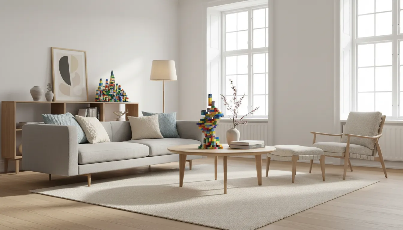
Minimalist web design represents a fundamental shift in how we approach digital aesthetics and user experience—prioritizing essential elements, removing visual clutter, and creating breathing room that allows content to truly shine. At its core, minimalism isn't about creating stark, empty websites devoid of personality, but rather about deliberately choosing what to include and what to eliminate, ensuring every element serves a clear purpose and contributes meaningfully to the user journey. This design philosophy emerged as a reaction to the information overload and visual chaos that characterized early web design, where designers attempted to cram every possible feature, image, and piece of content onto a single page in fear of users not discovering deeper content. The result was cluttered, overwhelming websites that confused rather than guided users, buried important information under decorative elements, created cognitive overload that exhausted visitors, and performed poorly due to excessive assets and complex layouts.
The minimalist approach flips this paradigm by embracing the principle that less is genuinely more—fewer elements mean each remaining element gains importance and visibility, reduced visual noise allows users to focus on what truly matters, simplified layouts create intuitive navigation paths, and streamlined designs load faster and perform better across devices. This philosophy draws inspiration from various design movements including Bauhaus with its form-follows-function ethos, Swiss design with its emphasis on typography and grid systems, and Japanese aesthetics with concepts like ma (negative space) and wabi-sabi (finding beauty in simplicity and imperfection). These influences combine to create a design approach that values clarity over decoration, function over flash, and purpose over ornamentation.
Successful minimalist web design requires discipline and restraint—constantly asking whether each element is truly necessary, whether each design choice serves the user's goals, and whether the overall composition achieves clarity and focus. It's paradoxically more challenging to design minimalist websites than cluttered ones because there's nowhere to hide design weaknesses or fill empty space with decorative distractions. Every element must be precisely placed, every spacing decision intentional, and every color choice deliberate. This thoughtful curation creates websites that feel effortless and intuitive to users while actually representing significant design expertise and careful consideration. When executed well, minimalist design appears simple but functions brilliantly, guiding users seamlessly through content and actions while creating a memorable visual impression that communicates sophistication, modernity, and confidence.
Strategic Use of White Space and Negative Space
White space—also called negative space—is the unmarked area between and around design elements, and it stands as perhaps the most powerful tool in the minimalist designer's arsenal. Despite its name, white space doesn't need to be white; it simply refers to empty space not occupied by text, images, buttons, or other interface elements. Many inexperienced designers view empty space as wasted space, feeling compelled to fill every pixel with content or decoration. This fundamental misunderstanding leads to cramped, claustrophobic layouts that overwhelm users and bury important information in visual noise. In contrast, minimalist designers recognize white space as an active design element that creates structure, establishes hierarchy, provides visual breathing room, directs attention to important elements, and creates a sense of elegance and sophistication.
Strategic white space deployment operates at two distinct levels—macro white space and micro white space. Macro white space refers to the large empty areas between major layout sections, creating clear separation between header and content, between content blocks, and around important calls-to-action. This generous spacing prevents different sections from visually bleeding into each other, allowing each content area to exist as a discrete, focused unit. Micro white space refers to the smaller spacing between individual elements within a section—line spacing in paragraphs, padding around buttons, margins around images, and letter-spacing in headings. Proper micro white space dramatically improves readability, making text easier to scan and digest, creating comfortable reading rhythms, and preventing visual elements from appearing cramped or cluttered.
The amount of white space should align with the importance of content—surround critical elements like headlines, calls-to-action, and key images with generous white space to draw attention and create focal points. This technique, called isolation, makes important elements impossible to miss because they stand alone in an ocean of empty space. Apple's website exemplifies this approach masterfully, often featuring a single product image with minimal text floating in vast white space, creating an unmistakable focus that guides the eye exactly where Apple wants it. Conversely, less important elements can be grouped more closely together, using reduced white space to indicate their secondary status in the visual hierarchy.
Implementing Effective White Space Strategies
Use consistent spacing systems rather than arbitrary spacing decisions. Design systems often employ spacing scales based on multiples of a base unit—for example, 4px, 8px, 16px, 24px, 32px, 48px—creating visual rhythm and harmony throughout the design. This consistency makes layouts feel cohesive and intentional rather than random. Consider the reading experience when setting line height and paragraph spacing—text becomes difficult to read when lines are too close together or too far apart. Generally, body text should have a line height of 1.5 to 1.8 times the font size, with paragraph spacing approximately equal to the line height to create clear breaks between thoughts without excessive gaps.
Balance white space with content density to avoid creating designs that feel too sparse or empty. While generous white space is a hallmark of minimalism, too much creates the impression of missing content or incomplete pages. The goal is breathing room, not barrenness. Test your designs with actual content rather than lorem ipsum placeholder text, ensuring white space decisions still work when filled with real words, images, and interface elements. Responsive design requires careful white space adjustment across breakpoints—generous desktop spacing often needs reduction on mobile to avoid excessive scrolling while maintaining readability and visual comfort.
Typography as the Primary Design Element
In minimalist design, typography often becomes the dominant visual element, carrying the aesthetic and functional weight that ornate graphics, complex layouts, and decorative elements bear in more maximalist approaches. When you strip away background images, remove decorative illustrations, and eliminate superfluous interface chrome, typography must step forward to create visual interest, establish hierarchy, communicate brand personality, and guide users through content. This elevation of typography from supporting role to leading character demands greater attention to typeface selection, sizing, spacing, and hierarchy than traditional design approaches where typography could hide among more visually dramatic elements.
Typeface selection becomes critical in minimalist design because with fewer design elements, each choice carries more weight. Many minimalist designs use just one or two typeface families—often a sans-serif for its clean, modern appearance that reads well at all sizes and aligns with minimalist aesthetics. Popular choices include Helvetica Neue for its timeless neutrality, Inter for its excellent screen readability, Work Sans for its geometric precision, or Poppins for its approachable friendliness. Some designers pair a sans-serif for body text with a serif for headlines to create subtle contrast without introducing visual complexity. This typographic pairing establishes hierarchy through font family while maintaining overall simplicity—serif headlines provide elegant distinction while sans-serif body text ensures comfortable reading.
Font size variations create hierarchy and visual interest in minimalist layouts where color and decorative elements play minimal roles. Dramatic size differences between heading levels and body text create clear information architecture—massive hero headlines at 60-80px or larger announce primary messages, major section headings at 32-48px divide content into digestible chunks, subheadings at 24-32px break sections into subsections, and body text at 16-18px ensures comfortable reading on modern high-resolution displays. These significant size jumps might feel excessive when first implemented, but they create the visual dynamics and clear hierarchy essential for minimalist designs to succeed. Remember that digital design allows more dramatic scaling than print because screen real estate is functionally infinite through scrolling.
Advanced Typography Techniques
Line length (measure) dramatically impacts readability—lines that are too long cause readers to lose their place when moving from the end of one line to the beginning of the next, while lines that are too short create a choppy reading rhythm. Optimal line length for body text is generally 50-75 characters (about 10-15 words), though this varies based on language, audience, and context. Control line length through max-width constraints on text containers rather than relying on viewport width, ensuring readable measures even on ultra-wide displays. Letter-spacing (tracking) and word-spacing adjustments can create distinctive typographic treatments, though use these sparingly—excessive letter-spacing in body text reduces readability, while tight letter-spacing in all-caps headings can improve cohesion.
Font weight variation provides hierarchy and emphasis without introducing additional colors or decorative elements. Most modern typeface families include multiple weights—light (300), regular (400), medium (500), semibold (600), bold (700), and sometimes black (800-900). Use weight variation to create subtle emphasis within text, differentiate interface labels from values, and establish heading hierarchy through both size and weight changes. Ensure sufficient contrast between weights to create clear distinction—moving from regular to semibold may not provide enough differentiation, while jumping to bold creates unmistakable emphasis. Test weight choices at actual size because some weights that look distinct at large sizes become indistinguishable when reduced to body text size.
Limited Color Palettes for Maximum Impact
Minimalist design typically employs strictly limited color palettes—often just 2-3 colors plus neutral tones like black, white, and grays. This constraint forces intentional color usage where each hue serves a specific purpose rather than adding color arbitrarily for decoration. A common minimalist palette structure includes a primary brand color used for key interface elements, important headlines, and primary calls-to-action; a secondary accent color for highlights, notifications, or alternative actions; and neutral grays for body text, backgrounds, and borders. Some minimalist designs go even further, using only black, white, and shades of gray in true achromatic schemes that rely entirely on typography, spacing, and layout for visual interest.
The primary color becomes the brand signature, appearing consistently in logo, navigation, buttons, and key headlines to create strong brand association. This color should be carefully selected to communicate appropriate brand values—blue suggests trust and professionalism, green implies growth and sustainability, red conveys energy and urgency, purple suggests creativity and luxury, and orange communicates friendliness and approachability. Consider color psychology and cultural associations when making this foundational choice. The secondary color provides contrast and variation, preventing the design from feeling monotonous despite its simplicity. This accent color often sits opposite the primary on the color wheel, creating complementary contrast that makes both colors appear more vibrant when used together.
Neutrals do the heavy lifting in minimalist palettes, comprising the majority of the color scheme. White or very light gray backgrounds create the clean, airy feeling associated with minimalism while providing excellent contrast for text and interface elements. Dark text (true black or dark gray around #333333) ensures readability against light backgrounds. Mid-tone grays serve for borders, dividers, and secondary text that needs to recede into the background. This neutral foundation allows the limited accent colors to stand out dramatically when introduced, creating focal points that guide attention effectively. Strategic color absence becomes as important as color presence—large areas of neutral background make occasional color splashes impossible to miss.
Implementing Color Effectively
Use color purposefully rather than decoratively—every color appearance should serve a function like indicating clickability, showing status (success/error/warning), grouping related elements, or emphasizing important content. When color serves clear purposes, users quickly learn what different colors mean in your interface, improving usability through consistent color language. Ensure sufficient color contrast for accessibility—WCAG guidelines require minimum contrast ratios of 4.5:1 for normal text and 3:1 for large text (18pt or 14pt bold). Many beautiful minimalist designs fail accessibility standards by using low-contrast grays that are elegant but unreadable. Use contrast checking tools to verify your color combinations meet accessibility requirements before finalizing your palette.
Create color systems with multiple shades of each color to handle various use cases—lighter tints for backgrounds and subtle elements, saturated mid-tones for primary applications, and darker shades for text or hover states. Many design systems generate 10-shade palettes for each color, numbered from 50 (lightest) to 900 (darkest), providing flexibility while maintaining color harmony. Test your palette against white, black, and gray backgrounds to ensure it works across all contexts. Some colors appear vibrant against white but get lost against gray, requiring adjustment to maintain consistent visual weight across different background contexts.
Simple Navigation Structures
Minimalist navigation prioritizes simplicity and clarity over comprehensive site maps or feature-stuffed menus. Rather than exposing every possible navigation option upfront, minimalist approaches show only the essential paths, trusting users to find deeper content through clear information architecture rather than exhaustive navigation menus. This streamlined approach typically features 5-7 main navigation items in a clean horizontal menu or minimal vertical sidebar, progressive disclosure that reveals deeper navigation only when needed, clear visual hierarchy indicating current location, and generous click targets with ample spacing between items to prevent mis-clicks and support touch interfaces.
The hamburger menu—three horizontal lines indicating a hidden menu—has become synonymous with minimalist mobile navigation despite ongoing debate about its usability. When implemented thoughtfully, hamburger menus clean up mobile interfaces by hiding navigation off-canvas until explicitly requested, preserving precious mobile screen real estate for content. However, hidden navigation can reduce discoverability of important sections and increase the number of taps required to access content. Consider hybrid approaches that show the most important 3-4 navigation items persistently while hiding secondary items behind a hamburger menu, balancing visibility with simplicity.
Sticky or fixed navigation that remains visible while scrolling provides persistent wayfinding without cluttering content areas. In minimalist implementations, sticky navigation often condenses as users scroll down—a full-height header with logo, navigation, and perhaps a tagline shrinks to show only a minimal logo and navigation items, reducing its footprint while maintaining accessibility. This progressive reduction demonstrates minimalist principles applied to interactive elements, showing exactly what users need at each moment without excess. Ensure sticky navigation is truly necessary before implementing it, as it permanently reduces available screen height; many minimalist designs forgo sticky navigation entirely in favor of full-height navigation that disappears during scrolling to maximize content viewing area.
Navigation Best Practices for Minimalist Design
Use clear, concise labels that communicate destination clearly without jargon or cleverness—users should never have to guess what they'll find when clicking a navigation item. Minimalist design has no room for ambiguity. Ensure mobile navigation maintains the same clarity and simplicity as desktop navigation, avoiding the temptation to hide important options simply because screen space is limited. Some content that seems secondary on desktop may be critical for mobile users with different contexts and goals. Implement breadcrumb navigation on deeper pages to show hierarchical location and provide easy backtracking, particularly important when primary navigation is hidden or condensed.
Consider mega menus for sites with complex hierarchies, but implement them minimally—clean layouts with plenty of white space, clear section headings, and limited sub-items prevent mega menus from becoming overwhelming. The goal is to provide helpful shortcuts to deeper content without creating visual overload that defeats minimalist principles. Use subtle animations to guide attention during navigation transitions—gentle fades or slides create polish without unnecessary flourish, maintaining the refined aesthetic while providing helpful feedback that actions have registered.
Performance Benefits: Faster Load and Fewer Assets
Beyond aesthetic and user experience advantages, minimalist design delivers concrete performance benefits that improve user satisfaction, SEO rankings, and conversion rates. Fewer design elements directly translate to fewer HTTP requests, smaller page sizes, faster load times, reduced bandwidth consumption, and lower server load. A typical minimalist website might load in 1-2 seconds on a decent connection, while a design-heavy site with multiple large images, custom fonts, animation libraries, and extensive CSS might take 5-10 seconds or more. In an era where 53% of mobile users abandon sites that take longer than 3 seconds to load, this performance difference directly impacts business success.
Minimalist designs typically employ fewer custom fonts—often just one or two font families instead of four or five—dramatically reducing font loading overhead. Each font family adds to initial page weight, with some web font files reaching 100-200KB or more for a complete family with multiple weights and styles. By limiting font variety, minimalist sites reduce this burden while actually improving typographic coherence. Similarly, limited color palettes and simple graphics reduce CSS complexity and often eliminate the need for multiple large image files for visual interest. Backgrounds might be solid colors or subtle gradients (generated via CSS rather than image files), icons might use SVG or icon fonts instead of PNG/JPG images, and decorative elements might be created with CSS shapes and borders rather than photographic assets.
Simple layouts with generous white space generally require less complex CSS and JavaScript, improving parse and render times. Minimalist designs often avoid complex grid systems, elaborate animations, parallax scrolling effects, and other resource-intensive features in favor of clean, straightforward layouts that browsers can render efficiently. This simplicity also improves compatibility across devices and browsers—simpler code has fewer opportunities for cross-browser inconsistencies or layout breakage on edge-case devices. The result is websites that not only load faster but also run more smoothly, scroll more fluidly, and consume less battery on mobile devices.
Optimizing Minimalist Designs for Peak Performance
Even minimalist designs benefit from performance optimization techniques. Implement lazy loading for images and other media, loading only what appears in the initial viewport and deferring below-the-fold content until users scroll down. This dramatically improves initial page load while ensuring all content remains accessible. Use modern image formats like WebP that provide significantly better compression than JPEG or PNG, reducing file sizes by 25-35% without quality loss. Implement responsive images that serve appropriately sized files for each device—sending 2000px images to mobile devices wastes bandwidth and processing power when 800px images would look identical on small screens.
Minimize and combine CSS and JavaScript files to reduce HTTP requests. While HTTP/2 and HTTP/3 reduce the penalty of multiple small files, combined and minified files still load faster by eliminating redundant code and reducing parsing overhead. Implement critical CSS inlining that embeds styles needed for above-the-fold content directly in the HTML, allowing initial content to render before external stylesheets finish downloading. Use a content delivery network (CDN) to serve static assets from geographically distributed servers, reducing latency for users far from your origin server. Monitor performance regularly using tools like Google PageSpeed Insights, GTmetrix, or WebPageTest, identifying optimization opportunities as your site evolves.
User Experience: Reduced Cognitive Load
Perhaps the most compelling argument for minimalist design lies in cognitive psychology—human brains can only process limited information simultaneously before becoming overwhelmed. Cognitive load refers to the mental effort required to process information, and excessive cognitive load leads to confusion, frustration, decision paralysis, and ultimately abandonment. Cluttered websites with dozens of competing elements create high cognitive load by forcing users to scan and evaluate numerous options, filter relevant from irrelevant information, decode complex visual hierarchies, and navigate confusing layouts. This mental taxation exhausts users quickly, particularly on mobile devices where small screens amplify complexity.
Minimalist design reduces cognitive load through deliberate simplification—showing only essential elements eliminates unnecessary processing, clear visual hierarchy guides attention to important information first, generous white space prevents overwhelming visual density, and simple navigation reduces decision-making burden. This reduction in mental effort creates more enjoyable, less stressful user experiences that keep visitors engaged longer and increase likelihood of completing desired actions. Users can focus on content and tasks rather than decoding interface complexity, making it easier to find information, complete purchases, submit forms, or consume content without distraction or confusion.
The paradox of choice suggests that too many options actually decrease satisfaction and increase decision paralysis. When presented with dozens of choices, users struggle to make decisions, fear making wrong choices, and often abandon the decision entirely rather than risk regret. Minimalist design combats this by curating options, presenting fewer but more intentional choices that guide users toward success. This doesn't mean hiding important options, but rather organizing and prioritizing choices to prevent overwhelming users with simultaneous options. Progressive disclosure techniques reveal additional options only when users indicate interest, maintaining simplicity while preserving access to comprehensive functionality for users who need it.
Designing for Cognitive Ease
Implement single-column layouts that create natural reading flows, particularly on mobile devices. Multi-column layouts force eyes to jump between columns, creating cognitive overhead as users decide which column to read next. Single columns create straight, top-to-bottom flows that require minimal thought. Use familiar patterns and conventions rather than innovative interface designs that require learning new interaction models. Users bring expectations from thousands of previous websites—violating these expectations without good reason creates unnecessary cognitive burden. Place navigation where users expect it (top or left), make logos clickable to return home, and use standard icons and labels for common actions.
Front-load important information in headings, summaries, and first sentences, allowing users to scan efficiently without reading every word. Most users scan rather than read, seeking specific information or deciding whether content merits full attention. Minimalist design supports this behavior through clear information hierarchy and generous spacing that makes scanning easy. Eliminate unnecessary fields from forms, asking only for essential information. Every form field adds cognitive and physical effort, increasing abandonment rates. Minimalist forms show only required fields, using progressive disclosure to request optional information after core data is collected. Use single-column form layouts with clearly labeled fields, helpful inline validation, and logical ordering that matches mental models.
Brand Perception: Modern, Sophisticated, Professional
Minimalist design communicates powerful messages about brand personality and values—sophistication, confidence, modernity, quality, and attention to detail. Companies that embrace minimalism signal that they're confident enough in their offerings to let products and content speak for themselves without excessive decoration or hard-sell tactics. This restraint suggests professionalism and maturity, particularly effective for premium brands, B2B services, professional services, technology companies, and luxury products. Apple's minimalist website and product design exemplify this approach—vast white space, huge product images, minimal text, and generous spacing communicate premium positioning more effectively than elaborate decoration ever could.
The discipline required for successful minimalist design demonstrates attention to quality—every element is thoughtfully considered, every detail intentionally designed, and every choice serves user goals rather than designer ego. This careful curation translates in users' minds to similar attention to quality in products and services. If a company demonstrates this level of consideration in their website, users reason, they likely bring similar care to their core offerings. Conversely, cluttered websites with inconsistent design, arbitrary element placement, and visual chaos suggest carelessness and lack of attention to detail that users may project onto products and services.
Minimalism communicates modernity and forward-thinking perspectives. While ornate, decorated designs can appear dated quickly as design trends evolve, clean minimalist aesthetics prove more timeless, maintaining relevance across years rather than looking outdated within months. This longevity provides better return on design investment and positions brands as contemporary and progressive. Tech companies particularly benefit from minimalist approaches that align with perceptions of innovation, simplicity, and user-centered design that characterize successful technology products from smartphones to software interfaces.
Examples: Leading Brands Embracing Minimalism
Apple pioneered and perfected minimalist web design, with pages featuring single hero products floating in white space, minimal navigation, and generous typography. This approach extends their product design philosophy to digital presence, creating cohesive brand experience across touchpoints. Dropbox transformed their website from cluttered feature lists to clean, illustration-focused pages with clear value propositions and simple layouts emphasizing their core benefits. Medium built their entire platform around minimalist principles—typography-focused reading experience, generous margins, limited color, and zero visual clutter that lets content shine without competition from interface elements.
Stripe employs minimalism with sophisticated interactions—clean layouts, limited color palette dominated by purple accents and neutrals, clear product sections with ample white space, and subtle animations that add polish without excess. Airbnb combines minimalism with high-quality photography—generous spacing, clean layouts, and simple navigation frameworks showcase stunning property images without interface elements competing for attention. These examples demonstrate that minimalism doesn't mean boring or generic—strong brand identity, excellent content, and thoughtful interaction design create distinctive experiences within minimalist frameworks.
Why Choose M&M for Your Minimalist Design
At M&M Communications, we specialize in crafting minimalist websites that balance aesthetic elegance with business functionality. Our design approach prioritizes user experience and conversion goals while creating the clean, sophisticated visual presence that minimalism enables. We understand that successful minimalism requires deep expertise—knowing what to remove is often harder than knowing what to add, and creating effective designs with limited elements demands exceptional skill in typography, spacing, color, and hierarchy. Our portfolio demonstrates our capability across industries, from professional services requiring authoritative sophistication to e-commerce sites needing clean product showcases to technology companies demanding modern, innovative aesthetics.
Our minimalist design process begins with deep discovery to understand your brand values, target audience, business goals, and content strategy. We don't impose minimalism where it doesn't fit—some businesses and audiences benefit from more visual richness—but when minimalism aligns with your positioning and goals, we execute it masterfully. We develop comprehensive design systems that define typography scales, spacing systems, color palettes, and component libraries ensuring consistency across all pages and touchpoints. These systems enable efficient design expansion as your website grows, maintaining coherence without requiring redesign for every new page or feature.
Start Your Minimalist Design Project Today
If you're ready to embrace the power of minimalist design—faster performance, improved user experience, reduced cognitive load, and sophisticated brand perception—contact M&M Communications today to discuss your project. Our design team will evaluate your current website or design requirements, recommend appropriate minimalist approaches that align with your brand and goals, and develop comprehensive design solutions that combine aesthetic excellence with measurable business results.
Call us at 0909 123 456 or email hello@mmcom.vn to schedule your design consultation. Whether you need complete website redesign, landing pages for marketing campaigns, or design system development for product consistency, our team has the expertise to deliver minimalist designs that work beautifully and perform exceptionally. Let's create something clean, simple, and remarkably effective.
M&M Communications—your trusted partner for minimalist web design that combines aesthetic sophistication with business performance through thoughtful simplification, strategic design decisions, and relentless focus on user experience and conversion goals.

