In the digital world, we often talk about user experience, load speed, and beautiful design. But there is a foundational element, a design philosophy without which all those other factors become meaningless to millions of people: Web Accessibility.
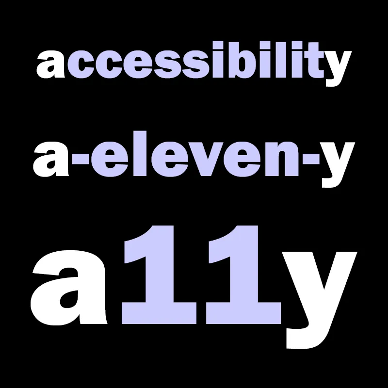
Often abbreviated as "A11y" (the letter 'a', 11 letters in the middle, and the letter 'y') , web accessibility is a set of principles and techniques for designing and developing websites, tools, and technologies that can be used by everyone, regardless of their abilities, disabilities, or circumstances. This is not an "optional feature" or a charitable act; it is a fundamental right in the information age and a mandatory requirement of human-centered design.
It's crucial to distinguish this from related concepts :
- Accessibility (A11y): Addresses discriminatory aspects related to providing an equivalent user experience for people with disabilities.
- Usability: Focuses on designing products to be effective, efficient, and satisfying for a specified group of users.
- Inclusion: A broader concept about diversity and ensuring participation for everyone to the greatest extent possible.
The risk is approaching A11y as a mere "checklist." When this happens, "the human interaction aspect is often lost, and accessibility is not achieved." The true goal is not just technical compliance but "usable accessibility" —a blend of technical standards and real-world human testing. This philosophy is a core component of modern UI/UX Design: Inclusive Design Principles.
This article will delve into why A11y is a business imperative, decode the global standards (WCAG), break down technical best practices, and analyze the legal context in Vietnam.
The Business Case: Why A11y is a Modern Imperative
For years, A11y was often seen as an unfortunate cost or a "nice-to-have" feature. This perspective is now obsolete. In the modern digital economy, A11y is a strategic investment that delivers a clear Return on Investment (ROI) through market expansion, search engine optimization (SEO), and brand protection.
Extend Market Reach
This is the most direct financial argument. Globally, there are over 1 billion people with disabilities, representing a market with a spending power of over $6 trillion. This market is often called "The Power of the Purple Dollar."
A U.S. government study found that 71% of website visitors with disabilities will leave a website that is not accessible. By ignoring A11y, you are voluntarily closing your door to a massive market segment. Furthermore, accessible design also benefits users without disabilities, including older adults with changing abilities, users with "temporary disabilities" (like a broken arm), and all users in non-ideal situations (like using a mobile device in bright sunlight).
The Synergy of A11y and SEO
One of the most immediate and underestimated benefits of A11y is its direct, positive impact on SEO. Fundamentally, A11y and technical SEO are two sides of the same coin. The reason is simple: Google's crawler (Googlebot) behaves much like a "blind" user. It doesn't "see" your site; it "reads" your source code.
This synergy is evident in several key areas:
- Alt Text: Screen readers use alt text to describe images to visually impaired users. Googlebot uses this same alt text to understand what an image contains, helping it rank in Google Images and providing context to the page.
- Heading Structure: Screen reader users navigate a page by jumping between headings (H1, H2, H3...). Googlebot also uses this logical structure to understand the hierarchy and importance of your content.
- Semantic HTML: Using tags like
<nav>and<main>helps screen readers identify content regions, and it also helps Googlebot parse and index your page accurately. - User Experience (UX) Signals: A11y best practices—like good contrast, clear navigation, and responsive design—improve the overall UX for everyone. Better UX leads to lower bounce rates and longer dwell times, which are key ranking signals for Google.
- Transcripts: Providing transcripts for video and audio content is a key A11y requirement. It also generates a large amount of keyword-rich, indexable text content that significantly boosts SEO.
This isn't just theory. One study that analyzed 847 domains found that after implementing accessibility solutions, websites saw an average increase in organic traffic of 12%.
Enhance Your Brand
A clear commitment to A11y demonstrates genuine Corporate Social Responsibility (CSR) and accelerates efforts in Diversity, Equity, and Inclusion (DEI). In a competitive market, consumers increasingly favor brands that demonstrate social responsibility. Proactively building a web for everyone creates a positive brand image and builds lasting customer loyalty.
Drive Innovation
Features designed for accessibility often solve unanticipated problems and end up benefiting all users.
- Closed Captions: Created for users who are deaf or hard of hearing, they are now widely used by people watching videos in noisy environments (like a train) or quiet ones (like an office).
- High Contrast: Designed for users with low vision, this feature helps everyone see their screen clearly in bright sunlight.
- Voice Control: Implemented for users with motor impairments, this is now a mainstream feature on smartphones and smart speakers.
Minimize Legal Risk
Accessibility-related lawsuits are increasing globally. In the United States, digital accessibility lawsuits filed under the Americans with Disabilities Act (ADA) have skyrocketed. Failure to comply can lead to expensive legal fees, costly settlements, and severe damage to your brand's reputation.
The Global Gold Standard: Decoding WCAG
The strongest driver for A11y is often legal pressure. Around the world, nations are enforcing laws requiring digital accessibility.
The Global Legal Landscape
A web of regulations now covers the digital globe:
- United States: The Americans with Disabilities Act (ADA) applies to "places of public accommodation," which the Department of Justice (DOJ) has repeatedly affirmed includes websites.
- Europe: The European Accessibility Act (EAA) mandates accessibility for public and private services, from e-commerce to banking.
- Canada: The Accessibility for Ontarians with Disabilities Act (AODA) has strict compliance requirements.
- United Kingdom: The Equality Act 2010 requires "reasonable adjustments" for people with disabilities.
For years, many of these laws (especially the ADA) lacked a specific technical standard. That ambiguity is gone. The global legal landscape has converged on a single benchmark: WCAG (Web Content Accessibility Guidelines) Level AA. The US DOJ, European EAA, and Canadian AODA all use WCAG 2.1 Level AA as the standard for compliance.
WCAG: The 4 POUR Principles
WCAG is the internationally recognized set of guidelines developed by the Web Accessibility Initiative (WAI) of the World Wide Web Consortium (W3C). You can learn more about W3C standards in our guide, Web Standards: W3C Guidelines.
Rather than a simple checklist, WCAG is built on four foundational principles, known by the acronym POUR:
- Perceivable: Information and UI components must be presentable to users in ways they can perceive. (e.g., alt text for the blind, captions for the deaf).
- Operable: UI components and navigation must be operable. (e.g., everything must work with a keyboard, not just a mouse).
- Understandable: Information and the operation of the UI must be understandable. (e.g., clear language, consistent navigation, predictable functionality).
- Robust: Content must be robust enough that it can be interpreted reliably by a wide variety of user agents, including assistive technologies (e.g., clean code that follows standards).
Conformance Levels: A, AA, and AAA
Under the POUR principles are testable success criteria, which are grouped into three levels of conformance. These levels are cumulative: to meet Level AA, you must first meet all of Level A.
- Level A (Minimum): This is the most basic level. It addresses the most severe barriers that would prevent some users from accessing content at all.
- Level AA (Industry Standard): This is the target for most public-facing websites and the level required by most international laws. It removes more significant barriers and provides a good level of accessibility.
- Level AAA (Highest): This is the highest, most stringent level. The W3C does not recommend requiring Level AAA for entire sites, as it's not always possible to meet for all types of content.
What's New? (WCAG 2.1 vs. 2.2)
Web standards are not static. WCAG 2.0 was published in 2008. WCAG 2.1 (2018) and WCAG 2.2 (October 2023) were published to build upon it.
- WCAG 2.1 added 17 new success criteria, primarily focusing on accessibility for mobile devices (touch gestures), users with low vision, and users with cognitive disabilities.
- WCAG 2.2 added 9 new success criteria and, significantly, removed one old one (4.1.1 Parsing). The new criteria further enhance mobile and cognitive accessibility, with requirements like Target Size (Minimum) (for touch targets), Focus Not Obscured (e.g., by sticky headers), and Consistent Help.
The clear recommendation for all organizations today is to target WCAG 2.2 Level AA. This ensures the most inclusive experience and "future-proofs" your site against evolving legal standards.
Building the Foundation: Technical Best Practices
Achieving WCAG conformance requires attention to detail in both design and code. Here are the most critical technical practices.
Structure is King: Semantic HTML and ARIA
The foundation of an accessible website is its HTML.
Semantic HTML: The Free Benefit The most basic rule of A11y is "use the right element for the right job." When you use a semantic HTML element like <button>, you get accessibility for free. The browser automatically provides:
- Role: It tells a screen reader, "This is a button."
- State: It manages states like "disabled."
- Keyboard Behavior: It's focusable with the Tab key and activatable with Enter and Spacebar.
When you use a non-semantic <div class="button">, you lose all of that. Key semantic practices include:
- Headings: Use
<h1>(once per page),<h2>,<h3>... in a logical, nested order to outline your content, like a table of contents. Never use heading tags just to make text big or bold; that's what CSS is for. - Landmarks: Use HTML5 tags like
<header>(banner role),<nav>(navigation),<main>(main), and<footer>(contentinfo). These create "landmarks" that allow screen reader users to skip entire blocks of content, for example, jumping directly to the<main>content. Learn more at Semantic HTML: Proper Structure.
ARIA: When HTML Isn't Enough Sometimes, native HTML can't describe complex modern widgets (like custom dropdowns, tabs, or modal dialogs). This is where ARIA (Accessible Rich Internet Applications) comes in. ARIA is a set of HTML attributes (like role or aria-label) that add missing semantics.
However, ARIA is powerful and dangerous. A famous saying in the A11y community is: "No ARIA is better than bad ARIA." Using ARIA incorrectly can create more barriers. Always follow the 5 Rules of ARIA:
- If you can use a native HTML element (like
<button>), use it. - Don't change native semantics (e.g., don't add
role="button"to an<h1>). - All interactive ARIA controls must be keyboard accessible.
- Don't hide focusable elements (e.g., role="presentation" or aria-hidden="true" on a focusable element).
- All interactive elements must have an accessible name.
Navigating for Everyone: Keyboard and Focus
For many users—including those with motor impairments, and blind users—the keyboard is the primary tool for navigation. A fundamental requirement is: All functionality available by mouse must be available by keyboard.
- Tab Order: The order in which users move through elements using the Tab key must be logical, predictable, and follow the visual flow of the page (left-to-right, top-to-bottom). This order is determined by the HTML source order (the DOM). Avoid using
tabindexwith a value greater than 0, as it breaks this natural order and creates chaos. - Focus Management: A user must always know where they are.
- Visible Focus: The keyboard focus (usually a blue outline) must be clearly visible. One of the most common and harmful A11y errors is hiding this with CSS (
outline:0oroutline:none). Don't remove it; style it if you must, but never hide it. - No Keyboard Traps: A user's focus must never get "trapped" in a widget (like a modal window) where they cannot press Tab or Esc to leave.
- Visible Focus: The keyboard focus (usually a blue outline) must be clearly visible. One of the most common and harmful A11y errors is hiding this with CSS (
- Skip Links: Imagine having to press Tab 50 times through the navigation menu on every single page just to get to the main content. A "Skip Link" (or "Skip to Main Content" link) solves this. It's an
<a>tag, usually the very first focusable item on the page, that links to the main content area (e.g.,<a href="#main-content">). It can be visually hidden until it receives keyboard focus, making it invisible to mouse users but a critical shortcut for keyboard users.
Visual Information: Alt Text and Color Contrast
Alternative (Alt) Text Alt text is a short text description provided for non-text content. Every image must have an alt attribute. How you write it depends on the image's purpose:
- Informative Images: These convey content. The alt text must describe the information the image contains. (e.g.,
alt="A golden retriever running on grass with a red ball.") Do not start with "Image of..." or "Photo of..."—the screen reader already announces this. - Decorative Images: These are purely for visual styling (like borders or abstract backgrounds) and convey no information. For these, use an empty alt attribute:
alt="". This tells the screen reader to skip it. Simply omitting thealttag is an error; the screen reader may read the file name ("IMG_4057.jpg") instead. - Functional Images: These are images used as links or buttons (like a logo or a search icon). The alt text must describe the function or action, not what the image looks like. (e.g.,
alt="Search"oralt="Go to Homepage").
Color Contrast and Color Blindness For users with low vision or color blindness, text that blends into the background is unreadable.
WCAG Level AA Contrast Ratios:
- 4.5:1 for normal-sized text.
- 3:1 for large text (defined as 18pt/24px, or 14pt/18.67px if bold).
- 3:1 for UI components and graphical objects (like form borders or icons).
The most important rule for color blindness is: Never use color as the only visual means of conveying information, indicating an action, or distinguishing an element.
- Bad Example: A required form field is only indicated by a red border.
- Good Example: The field has a red border, plus an icon, plus a text error message.
- Bad Example: Links in text are only identifiable by their color.
- Good Example: Links are identified by color and an underline.
- Charts/Graphs: Don't use color alone to distinguish segments. Use textures, patterns, or clear labels.
Complex Elements: Forms and Responsive Design
Accessible Forms Forms are critical interaction points and a common source of A11y failures.
- Labels: Every single input (
<input>,<select>) must have a programmatically associated<label>, using theforattribute (<label for="email">) linked to the input'sid(<input id="email">). Placeholder text (the gray text inside a field) is not a label; it disappears on input and is not reliably read by screen readers. - Error Messages: When validation fails, errors must be clear and specific. "Invalid input" is useless. "Error: Password must be at least 8 characters" is good.
- ARIA for Errors: To communicate the error to a screen reader, you must:
- Add
aria-invalid="true"to the failed<input>. - Give the text error message an
id. - Link the input to the error message using
aria-describedby="error-id". - Use a
role="alert"region, often at the top of the form, to announce "Your form has 3 errors" and link to each one.
- Add
Responsive & Mobile Accessibility Accessibility is just as critical on mobile. This includes responsive layouts, readable text, and allowing users to zoom.
A key mobile-specific issue is Touch Targets. Buttons and links must be large enough to be pressed reliably without hitting an adjacent item.
- The Rule: While WCAG 2.2 has a new standard, the long-standing platform guidance is the clearest. Google/Android recommend a minimum size of 48x48dp (device-independent pixels). Apple recommends 44x44pt. A 48dp target is about 9mm, the size of a finger pad.
- Tech Tip: Your icon doesn't have to look 48x48. You can use CSS
paddingto make the clickable area 48x48 while keeping the visual icon 24x24.
A11y Testing: From Automation to Human Insight
How do you know if your site is accessible? You must test, using a combination of automated tools and manual, human-driven methods.
Automated Testing Tools (axe, WAVE, Lighthouse)
Automated tools are a great first step. They are fast, easy, and catch many common technical errors.
- axe DevTools: A powerful browser extension and CI/CD tool from Deque. Its "Intelligent Guided Tests" (IGTs) can help find up to 80% of issues. It's famous for having "no false positives."
- WAVE: A free browser extension from WebAIM. Its strength is its visual approach, injecting icons directly onto your page to show errors, alerts, and structural elements.
- Lighthouse: Built directly into Google Chrome DevTools. It provides a performance, SEO, and accessibility score. Its accessibility audit is powered by the same engine as axe (
axe-core).
The "Iceberg" of Automated Testing
A critical warning: A 100/100 accessibility score on Lighthouse does NOT mean your site is accessible or compliant.
Automated tools can only detect 30-50% of all A11y issues. They are the "tip of the iceberg."
- What Automation CAN Find (The Tip): Binary, pass/fail technical issues. "Does this image have an
altattribute?" "Is the contrast ratio 4.5:1?" - What Automation CANNOT Find (Submerged): Anything that requires human context or logic.
- It can't tell if your alt text
alt="dog"is meaningful (the image might be a cat). - It can't tell if your tab order is logical.
- It can't tell if your link text "Click Here" is descriptive.
- It can't tell if your alt text
The most severe barriers are often in the submerged part, which can only be found with manual testing.
Manual Testing and Screen Readers (NVDA, JAWS, VoiceOver)
This is where human expertise is required to find the rest of the iceberg.
- The Keyboard Test: The simplest manual test. Unplug your mouse. Now, try to use your website. Can you reach and activate every button, link, and form field? Is the keyboard focus always visible? Do you get "trapped" anywhere?
- Screen Reader Testing: This is how you experience your site as a blind user. The most common screen readers are NVDA (Free, Windows), JAWS (Paid, Windows), and VoiceOver (Built-in, Mac/iOS).
- How to Test: Do not just press the down arrow key. Real screen reader users navigate using shortcuts. Press H to jump between Headings. Press D (NVDA) or R (JAWS) to jump between Landmarks (your
<nav>,<main>, etc.). - What to Look For: Is the heading/landmark structure logical? Are links descriptive (e.g., "Read more about our Q3 earnings" is good; 10 links just saying "Read more" is bad)? Is the alt text helpful or just noise? Are form errors announced clearly?
- How to Test: Do not just press the down arrow key. Real screen reader users navigate using shortcuts. Press H to jump between Headings. Press D (NVDA) or R (JAWS) to jump between Landmarks (your
The Context in Vietnam
Accessibility is not just a Western legal issue; it has a direct and pressing relevance in Vietnam.
According to official statistics from the Ministry of Labour, Invalids and Social Affairs, Vietnam has approximately 6.2 million people with disabilities. This is a significant part of the population with a fundamental right to access the information, education, employment, and public services that digital technology promises.
Vietnam's legal framework has acknowledged this:
- Law on Persons with Disabilities (2010): The foundational law (No. 51/2010/QH12) prohibits discrimination and promotes equal opportunity in all sectors, including technology.
- Article 43 (ICT): This key article states that the "State encourages agencies, organizations, enterprises, and individuals... to apply and develop information technology for persons with disabilities."
- Circular 26/2020/TT-BTTTT: This is the most important technical regulation from the Ministry of Information and Communications (MIC). It "regulates the application of standards and technologies to support people with disabilities in accessing and using information and communication products and services."
Crucially, Vietnam is not creating new standards from scratch. It is officially adopting the global standard. Reports from bodies like the UNDP, when analyzing Vietnam's public service portals, confirm that the technical criteria specified in Circular 26/2020 are taken directly from WCAG 2.0 Level A, which is used as the minimum mandatory baseline.
The message for private and public enterprises in Vietnam is clear: Compliance with Vietnamese law means compliance with WCAG. While Level A is the current minimum, targeting the global legal standard of WCAG Level AA is the smartest business strategy to ensure compliance, expand your market, and build a responsible, future-proof brand.
Conclusion: From Checklist to Culture
Web Accessibility is not a one-time project. It is not a feature you add at the end. It is not a dry, technical checklist.
A11y is an ongoing process and a core quality criterion, identical to performance or security. It demands a shift in mindset—from one of "compliance" to one of building a "culture of inclusion" that touches designers, developers, content writers, and project managers.
An accessible website is not just a legal requirement; it is a better website. It is easier to use, has higher SEO rankings, and serves more people.
Start today. You don't need a massive audit. Perform two simple tests on your homepage:
- Run an automated scan with the WAVE or axe DevTools browser extension.
- Unplug your mouse and see if you can still use your site.
The answers to these questions will show you where you are on the journey to building a web that is truly "Designed for Everyone."
Related news
Website Design Trends 2026: Technology Breakthroughs and Experience