Accessibility touches every layer of website delivery—research, UX, UI, copy, engineering, QA, infrastructure, operations, and procurement. This playbook walks through WCAG 2.1/2.2 AA in a practical, product-focused way so teams can ship inclusive experiences without endless rework. Use it as an end-to-end reference for discovery, design systems, component patterns, content standards, media handling, keyboard and screen reader support, testing, rollout, and continuous monitoring.
1. Foundations And Mindset
Accessibility is quality. The four WCAG pillars—Perceivable, Operable, Understandable, Robust—map directly to product risk: if users cannot perceive, operate, or understand your UI, conversions and trust collapse. Make accessibility part of the Definition of Ready/Done, not a post-launch audit. Shift from “just pass the audit” to “can a blind user complete checkout with a screen reader and keyboard only?” or “can a low-vision user read this in bright sunlight?”
Prefer native HTML. Elements like button, input, select, textarea, details/summary, and semantic headings already expose roles, states, and keyboard behavior. Use ARIA only to fill gaps and never override native semantics. Keep DOM order aligned to visual order; avoid CSS-only reordering that confuses focus.
2. Discovery And Requirements
Include people with disabilities in discovery interviews. Map critical journeys—search, navigation, authentication, checkout, account management—and log observed barriers (auto-playing carousels, missing focus, vague error messages). Define success metrics: task completion with NVDA/VoiceOver, form error recovery time, caption usage, contrast pass rates, drop-off by assistive tech users, support tickets tagged as accessibility.
Capture non-functional requirements: WCAG 2.1 AA (plus 2.2 focus-visible updates), keyboard-only operability, screen reader support (NVDA, JAWS, VoiceOver), high-contrast themes, reduced motion, dark mode implications, bilingual needs, and legal context (ADA-style obligations, procurement criteria, sector regulations). Bake them into user stories and acceptance criteria.
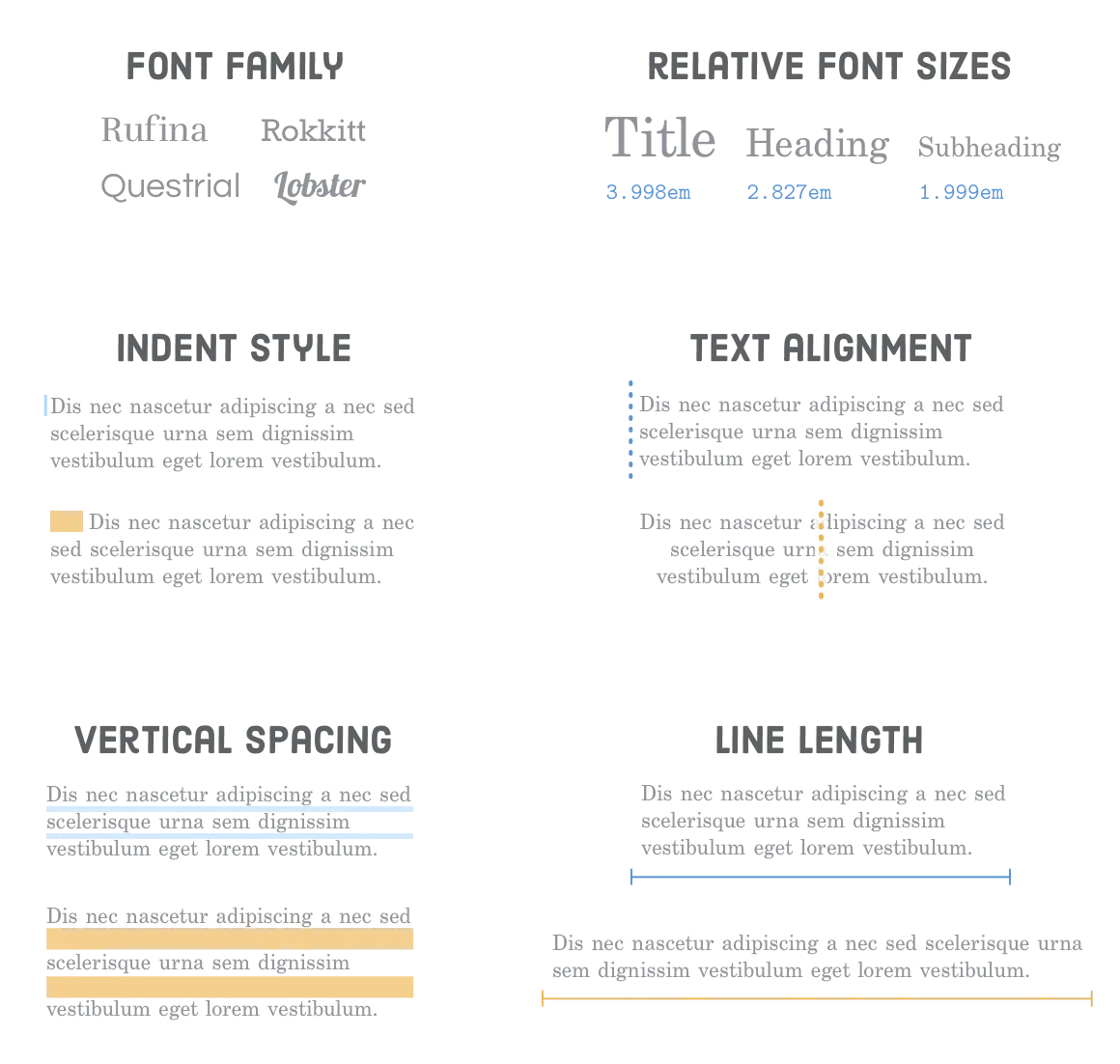
3. Color, Type, And Layout Tokens
Define color tokens with contrast baked in: target 4.5:1 for body text, 3:1 for large text and UI controls. Provide separate tokens for backgrounds, surfaces, borders, interactive states (hover, active, focus, disabled), and alerts (info/success/warning/error). Never rely on color alone—pair with icons or text.
Typography: establish a clear hierarchy with consistent scale, 45–75 characters per line, line-height around 1.5, adequate letter/paragraph spacing, and robust Vietnamese glyph support. Provide fallback stacks. Ensure weight choices don’t thin out at small sizes.
Spacing and grids: use spacing tokens that support generous touch targets (44x44px minimum), avoid cramped controls, and prevent overlap when text enlarges to 200%.
4. Components That Ship With Accessibility
Buttons and links: buttons for actions, links for navigation. Each needs discernible text, visible focus, and disabled semantics. Avoid ghost buttons with low contrast.
Forms: every control gets a label tied with for/id; placeholders never replace labels. Use fieldset/legend for grouped controls (radio/checkbox sets). Provide inline help and clear error messages, surfaced both near the field and in a summary at the top with anchors back to errors. Preserve user input on validation failure. Mark required vs optional explicitly; avoid asterisks without explanation.
Dialogs and overlays: trap focus inside, set aria-modal="true", restore focus to the trigger on close, and inert the background. Provide Esc and explicit close controls.
Navigation: include skip links, proper landmarks (header/nav/main/aside/footer), logical heading order (single H1 that expresses purpose), and consistent labels sitewide. Breadcrumbs must be keyboard and screen-reader friendly. For mega menus, support keyboard arrow navigation and escape to exit.
Tabs/accordions: follow WAI-ARIA APG patterns—arrow keys to move, Home/End to jump, Space/Enter to activate. Expose aria-selected/aria-controls, manage tabIndex properly, and keep panels in DOM for screen readers unless using aria-live updates.
Tooltips/toasts: avoid hover-only triggers; support focus and touch. Allow dismissal with Esc and provide sufficient timing. Ensure toasts do not steal focus.
Carousels: offer pause/stop, avoid auto-rotate faster than users can read, ensure controls are labeled and large enough, and keep content available outside the carousel when possible. Prefer static grids for critical information.
Data tables: use th with scope, captions, summaries for complex data, and aria-sort for sortable headers. Maintain responsiveness without hiding headers from assistive tech.
Media players: full keyboard control, visible focus, captions, transcripts, adjustable volume/speed, and no autoplay with sound.
5. Content And Media Standards
Alt text: write purpose-driven descriptions. Decorative images get empty alt="". Icons that convey status need accessible names. Complex charts require long descriptions or data tables.
Video/audio: provide captions (with speaker labels), transcripts, and audio descriptions where visuals carry meaning. Offer download or low-bitrate alternatives for slow connections.
Copy: use plain language, short sentences, and meaningful link text (avoid “click here”). Structure with headings and lists. Ensure bilingual content keeps meaning and clarity—translate alt text, captions, form labels, and error messages, not just body copy.
6. Motion, Dark Mode, And Theming
Respect prefers-reduced-motion: disable parallax, auto-scrolling, or flashing sequences; provide simple fades instead. Avoid content that flashes more than three times per second. For dark mode, use design tokens, adjust shadows/borders, and recheck contrast; don’t just invert colors. Ensure focus states remain visible in all themes.
7. Performance And Reliability
Performance is an accessibility feature. Optimize Core Web Vitals to reduce cognitive load. Avoid layout shifts that move focus or controls. Stream critical HTML before heavy JS; progressively enhance. Handle poor connectivity gracefully with clear messaging. Keep forms resilient to partial outages.
8. Testing Program
Automate: lint for aria misuse, run axe/Lighthouse/Pa11y in CI on key templates, and block merges on critical violations. Unit-test custom widgets for focus and keyboard behavior.
Manual: keyboard-only traversal (no mouse), screen reader sweeps (NVDA+Chrome, VoiceOver+Safari), contrast checks, zoom to 200%, reduced-motion mode, dark-mode passes, and mobile tests with TalkBack and VoiceOver. Use scenario scripts (search, filter, add to cart, pay) to catch real-world blockers.
User testing: run periodic sessions with assistive tech users (screen reader, switch device, low vision). Even 5–8 participants uncover systemic issues.
9. Delivery Workflow And Governance
Definition of Ready: acceptance criteria include semantic structure, focus states, labels, error behaviors, and contrast. Definition of Done: automated checks pass; manual keyboard and screen reader smoke tests done for the story.
Design handoff includes annotated focus states, contrast proofs, ARIA notes, and content guidance. Code review enforces semantic HTML and focus management. QA treats a11y blockers as P1 for critical flows.
Design system: document patterns with Do/Don’t examples, code snippets, and keyboard/ARIA requirements. Version components and run regression a11y tests on release.
Ownership: assign an accessibility lead to triage issues, track metrics, and coordinate audits. Train designers, engineers, PMs, writers, and QA quarterly.
10. Monitoring, Metrics, And Analytics
Track: automated audit scores, contrast failure counts, keyboard trap incidents, aria-* validation errors, caption/transcript usage, task completion with assistive tech, error recovery rates, and related support tickets. Monitor logs for focus exceptions and JS errors that break navigation. Schedule quarterly audits plus spot checks after major UI changes.
11. Legal, Risk, And Vendor Management
Publish an accessibility statement and feedback channel. For third-party widgets (chat, analytics, payments), demand VPAT/ACR evidence and test them yourself. Bake remediation SLAs into contracts. Prioritize remediation by user impact and legal exposure.
12. Migration Strategy For Legacy UI
Start with semantic fixes: headings, landmarks, labels, focus order. Swap custom controls for native equivalents. Add captions/transcripts to top media assets. Update color tokens incrementally to hit contrast targets. Replace complex widgets (date pickers, dropdowns) with accessible patterns.
13. Mobile And Multimodal
Touch targets: minimum 44x44px with sufficient spacing. Ensure gestures have keyboard equivalents. Support device rotations and dynamic type without breaking layout. Validate focus order and announcements on mobile screen readers. Provide offline/error states that are readable and operable.
14. SEO And Content Ops
Semantic HTML, descriptive headings, alt text, fast performance, and structured data improve both accessibility and SEO. Train content editors: enforce alt text, heading hierarchy, meaningful links, and caption policies. Add CMS guardrails (required alt, contrast checks for rich text, caption reminders on upload).
15. Change Management And Culture
Celebrate wins (e.g., improved completion rates for screen reader users). Share before/after examples. Run lunch-and-learns, maintain a pattern library, and include accessibility in onboarding. Create an escalation path for a11y issues and recognize contributors who fix them.
Bottom line: accessibility is continuous improvement. Treat it like performance or security—monitored, owned, and iterated—so every release moves the experience closer to “usable by everyone.”
16. Practical Checklists For Teams
Design checklist: confirm one H1 per view; heading order is logical; color pairs meet contrast; focus styles defined for all interactive states; iconography has text equivalents; motion mocks include reduced-motion variants; dark-mode tokens available; component annotations include keyboard patterns and ARIA mapping.
Content checklist: every image has alt (or decorative blank); links describe destinations; captions and transcripts planned for media; forms have clear instructions and error language; tone stays plain and concise; bilingual copy retains meaning and context; tabular data has summaries.
Engineering checklist: semantic elements first; no tabindex greater than 0; skip links early in DOM; landmarks present; custom controls follow APG; focus trap for dialogs; restore focus on close; announce status messages with aria-live; forms preserve input on errors; prevent focus loss on rerender; avoid scroll hijacking.
Testing checklist: keyboard-only pass end-to-end; screen reader smoke tests for core flows; contrast pass; zoom 200% without loss of functionality; reduced-motion verification; dark-mode verification; mobile TalkBack/VoiceOver pass; axe/Lighthouse/Pa11y clean for showstopper issues.
17. Patterns To Avoid
- Placeholder-as-label forms (lose context, break autofill/screen readers).
- Anchor tags without href (use button).
- Div/span controls with click handlers but no role or keyboard support.
- Carousels that auto-advance without pause.
- Modal stacks that lose focus.
- Overuse of aria-hidden that hides visible interactive content.
- Color-only validation (make text/icon).
- Infinite scroll without landmarks, pagination, or “load more.”
- Custom dropdowns rebuilt poorly instead of using native select or a vetted pattern.
18. Example Flows With Notes
Sign-up with email verification: label every field, offer password visibility toggle with aria-pressed, show password rules before typing, announce errors inline and in summary, prevent timeouts, ensure verification status uses aria-live polite.
Search and filter: ensure search has label and submit button; filters use checkboxes/radios with fieldset/legend; announce result counts; provide clear reset. For dynamic results, update aria-live region without stealing focus; preserve focus when toggling filters.
Checkout: breadcrumb for steps, progress indicator with text, shipping/billing forms labeled, saved addresses selectable via radio, payment iframes from gateways tested for focus and labels, confirmation screen readable with order details in plain text. Avoid forcing CAPTCHAs; if unavoidable, provide accessible alternatives.
Support chat: vet vendor; ensure chat launcher is focusable, labeled, and doesn’t hijack focus when opening. Inside chat, ensure message history is readable by screen readers, inputs are labeled, and notifications use aria-live without spamming.
19. Internationalization And Locale Nuance
Plan alternate fonts that fully cover Vietnamese diacritics; test weight rendering on Windows and Android. Adapt examples, currencies, address formats, and date/time pickers to locale. Provide language toggle with lang attributes on html and meaningful label text. Respect reading direction if adding RTL locales later.
20. Building An A11y Backlog
Run an initial audit, tag issues by severity and flow, and prioritize P1 (blocker) items for immediate sprints: missing labels, keyboard traps, contrast failures, broken focus, missing captions. P2 covers usability friction (unclear instructions, insufficient target size). P3 covers polish (aria-label refinements, live-region tuning). Track owner, due date, and regression notes.
21. Executive And Stakeholder Alignment
Translate accessibility into business language: lowered legal risk, improved conversion, reduced support costs, larger addressable market (1 in 5 people with disabilities), SEO lifts, and brand reputation. Show benchmarks of competitors’ a11y posture. Secure budget for audits, tooling, training, and remediation.
22. Tooling Stack Recommendations
- Design: Figma plugins for contrast and annotations; token libraries with contrast baked in.
- Code: eslint-plugin-jsx-a11y, stylelint a11y rules, storybook+a11y add-on, testing-library with accessible queries.
- Automation: axe-core in unit/integration tests, Lighthouse CI budgets, Pa11y for regression sweeps.
- Manual aids: Colour Contrast Analyser, NVDA/VoiceOver screen readers, Focus Indicator browser extensions, Responsively for zoom tests.
- Content: CMS validations for alt text and heading order, caption reminders on media upload.
23. Rolling Out In Stages
Phase 1: fix blockers on top journeys (navigation, search, account, checkout) and update color tokens. Phase 2: refactor shared components in the design system and propagate. Phase 3: deep-dive audits on long-tail templates (blog, help center, dashboards). Phase 4: establish monitoring and scheduled user testing. Communicate milestones, publish patch notes, and invite feedback from users relying on assistive tech.
24. Measuring Outcomes
Beyond audit scores, track conversions for users who rely on keyboard or screen readers (via respectful, aggregate signals like focus/ARIA usage), completion times, abandonment at form steps, and the ratio of accessibility tickets closed per release. Celebrate uplift stories—e.g., “screen reader checkout completion improved from 62% to 88%.”
With disciplined patterns, strong governance, and continuous testing, accessibility becomes a repeatable capability—not a fire drill before launches.
25. Case Study Blueprint And Maintenance Cadence
Blueprint: pick a flagship journey (e.g., course enrollment, loan application). Run a baseline audit, write a remediation plan with owners and deadlines, refactor components in the design system first, then retrofit templates. Pair every code change with a test: Storybook a11y check, keyboard walkthrough, and screen reader script. Publish a before/after summary with metrics to socialize impact.
Cadence: quarterly full audits, monthly spot checks on new releases, weekly CI reports to Slack, and a rolling backlog grooming session with design, engineering, and product. Keep a living “known issues” doc with mitigations and target fix dates.
26. Collaboration And Handoff Rituals
In backlog refinement, flag stories that touch interaction-heavy UI for a11y pairing. In design critiques, reserve explicit time for contrast, focus, motion, and copy clarity. In engineering kickoff, review keyboard/ARIA notes and test scripts. In QA signoff, require a11y evidence (screenshots of focus, audit logs).
Encourage pair testing between QA and designers on staging with screen readers; schedule 30-minute sessions per epic. Rotate team members through “accessibility champion of the sprint” to spread expertise.
27. Emergency Patterns
If you discover a blocker near launch—missing labels, broken focus, unreadable contrast—apply tactical mitigations: add temporary visible text labels, insert skip links, disable auto-play, increase color contrast via CSS overrides, or provide alternative static content. Document the patch and schedule a permanent fix to avoid accruing hidden debt.
Remember: small, fast fixes that restore operability are better than shipping a blocker. However, track them so they don’t linger.
With robust processes, you can keep releases on track while honoring the commitment that “everyone can use it.”
28. Sustaining Momentum
Keep accessibility visible: include a11y status in release notes, dashboards, and sprint reviews. Run quarterly brown-bag demos where engineers and designers show fixes that made real user impact. Invite customer support to surface recurring pain points from assistive-tech users. Keep a short “a11y guardrails” doc pinned in your repos so new hires ramp quickly.
Finally, budget time for refactoring debt each quarter. As frameworks, browsers, and WCAG evolve, revisit patterns—especially custom widgets—to ensure they still meet expectations. Sustained attention prevents regressions and proves that inclusive design is a permanent product principle, not a one-time project.
29. Quick Playbook For New Projects
Kickoff: set WCAG AA as a non-negotiable requirement and pick 3 top user journeys to benchmark. Design: use system tokens, annotate keyboard/ARIA, validate contrast early. Build: start with semantic HTML, add ARIA only when needed, write tests for focus and keyboard flows. Test: run keyboard + screen reader passes per story, automate axe/Lighthouse in CI, and watch for regressions. Launch: publish an accessibility statement and feedback channel. Post-launch: monitor logs, support tickets, and rerun audits monthly.
Use this as a checklist you revisit every sprint. A small investment in patterns, training, and audits pays back in fewer blockers, faster delivery, happier users, and stronger search performance. Inclusive experiences are simply better experiences.
Keep moving, measure relentlessly, and make accessibility a habit, not a hurdle.
Every release should leave the experience more inclusive than the last.