Color plays a crucial role in photography, not only in creating visual appeal but also in conveying emotions and messages that the photographer wishes to express. Understanding the principles of color coordination and the significance of different colors will help you create visually stunning, harmonious, and meaningful photographs. In this article, we will explore the basic principles of color coordination in photography and the meaning of each color.
1. Basic Principles of Color Coordination in Photography
a. The Color Wheel
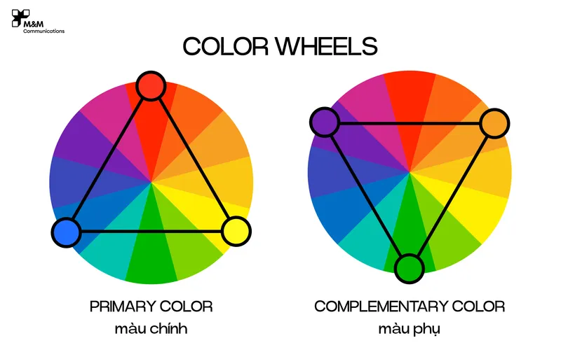
The color wheel is a fundamental and essential tool for understanding how colors work together. It consists of primary colors (red, blue, yellow), secondary colors (orange, green, purple), and tertiary colors created by mixing primary and secondary colors. Understanding the color wheel makes it easier to coordinate colors in your photos to create harmony or striking contrast.
b. Monochromatic Color Scheme
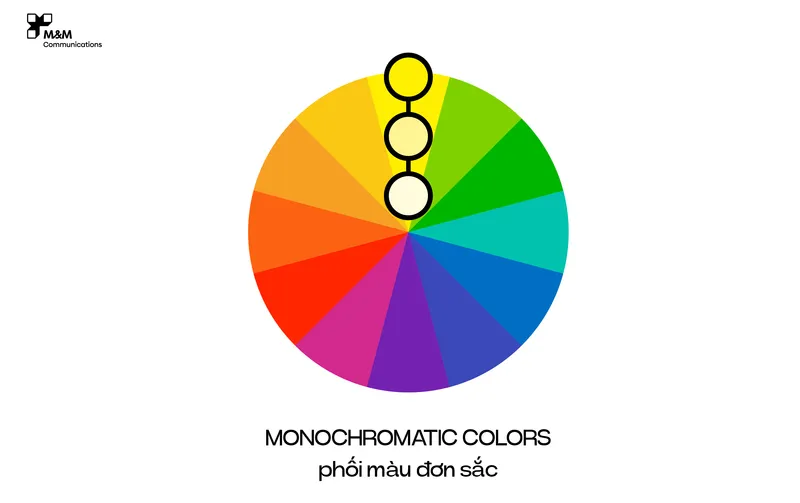
A monochromatic color scheme uses different shades of a single color. This creates unity and is pleasing to the eye. In photography, monochromatic color schemes are often used to highlight the subject or create a subtle, refined feel.
c. Complementary Colors
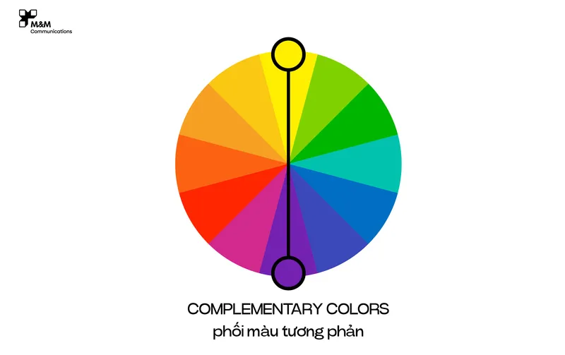
Complementary colors are those that are opposite each other on the color wheel, such as red and green, blue and orange, or purple and yellow. The strong contrast between these colors creates a striking and eye-catching effect. In photography, complementary colors are often used to make the subject stand out or to create a dramatic visual impact.
d. Analogous Colors
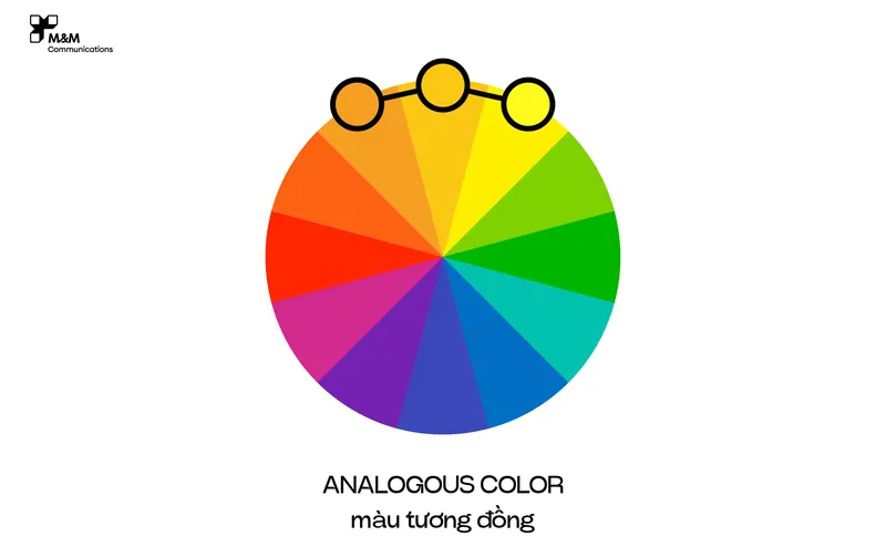
Analogous colors are next to each other on the color wheel, such as green, yellow, and orange. Photos using analogous colors have a soft, harmonious, and natural feel. This color scheme is often used in landscape photography or when aiming to create a sense of calm.
e. Triadic Colors
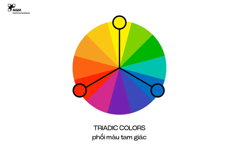
A triadic color scheme combines three evenly spaced colors on the color wheel, such as red, blue, and yellow. This combination creates balance and vibrancy, ideal for lively and energetic photographs.
>>> What benefits do impressive product images bring to business?
2. The Meaning of Colors in Photography
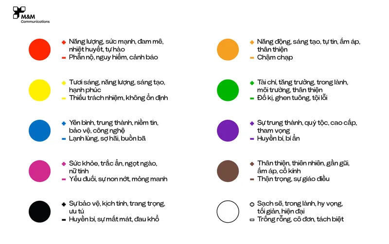
a. Red
Red is the color of energy, passion, and strong emotions. In photography, red is often used to draw attention, make a statement, or convey messages of love, intensity, or even danger. Red can also evoke a sense of urgency and stimulate action.
b. Blue
Blue symbolizes peace, trust, and stability. It is commonly used in photography to create a serene, cool, or professional atmosphere. Depending on the context, blue can also evoke feelings of sadness or distance.
c. Yellow
Yellow represents light, happiness, and optimism. In photography, yellow is often used to evoke warmth, joy, and energy. However, overuse of yellow can lead to feelings of anxiety or discomfort.
d. Green
Green symbolizes life, nature, and freshness. In photography, green is often used in landscape shots to convey vitality and harmony with nature. Green also evokes a sense of peace and balance.
e. Purple
Purple is associated with creativity, mystery, and luxury. In photography, purple is often used to create a dreamy, romantic feel or to emphasize uniqueness and distinction. Purple can also evoke a sense of mystery or mysticism.
f. Orange
Orange combines the warmth of red and the happiness of yellow. It is a color of creativity, warmth, and friendliness. In photography, orange is often used to evoke energy, joy, or to draw attention more subtly than red.
g. White
White represents purity, simplicity, and cleanliness. In photography, white is often used as a background to highlight the subject, create contrast, or convey elegance and lightness. White can also signify new beginnings or emptiness.
h. Black
Black is the color of mystery, power, and sophistication. In photography, black is often used to create strong contrast, emphasize the subject, or evoke a sense of darkness, mystery, or elegance. Black can also symbolize minimalism and simplicity.
3. Applying Color Coordination Principles and the Meaning of Colors in Photography

Applying color coordination principles and understanding the meaning of colors in photography will help you create images that are not only visually appealing but also deeply meaningful. Here are some practical tips:
Choose colors that match your theme: Before shooting, identify the message you want to convey and select colors that support that message.
Use colors to guide the viewer's eye: Arrange color elements in your photo to lead the viewer's eye to the most important part of the image.
Leverage contrast and harmony: Combine different color principles to create images that are both engaging and balanced.
If you still don't know how to combine colors in photography, M&M Communications is ready to advise and support you.
>>> Professional product photography with M&M Communications
Conclusion
Color in photography is not just an aesthetic element; it is a powerful tool for conveying messages and emotions. Understanding the principles of color coordination and the meaning of colors will enhance your creativity and improve the quality and impact of your photographs. Experiment with colors and explore their potential to create unique and memorable photographic works.