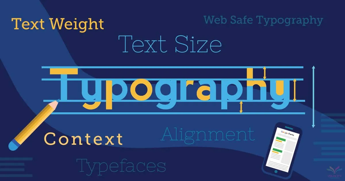
Typography is the backbone of web design: it controls readability, brand tone, credibility, and even perceived speed. A great type system covers selection, pairing, scale, rhythm, performance, accessibility, localization, and governance so teams can ship consistent pages without constantly reinventing. This playbook gives you a start-to-finish plan to build professional web typography that works for Vietnamese and global audiences.
1. Goals And Principles
Decide the job typography must do: clarity first for content-heavy sites, emotion and personality for branding, conversion focus for landing pages, or neutrality for complex apps. Anchor on readability (comfortable sizes, contrast, spacing), hierarchy (clear levels, predictable rhythm), consistency (tokens and rules), accessibility (WCAG, dyslexia-friendly choices), and performance (fast paints, minimal layout shift).
2. Font Selection Strategy
Serif vs sans: serifs feel editorial/traditional; sans-serif feels modern/neutral. Pair one workhorse body face with an expressive display face; avoid more than two families. Evaluate legibility at small sizes on Windows and Android where rendering is harsher.
Licensing and hosting: prefer web-safe or Google/Adobe Fonts when budgets are tight; otherwise self-host with proper licensing to control performance. Ensure legal coverage for pageviews. Use modern formats (WOFF2 primary, WOFF fallback) and subset character sets.
Vietnamese coverage: verify full support for diacritics (ă â đ ê ô ơ ư and tone marks). Test multiple weights to avoid misaligned accents. Include fallback stacks with Vietnamese-safe fonts.
Variable fonts: one file can cover weights, widths, italics, and optical sizing. They reduce requests and improve flexibility but watch file size; subset axes and ranges.
3. Pairing And Roles
Define roles: display (H1/H2), body, UI controls, monospace for code, accent for small highlights. Pair by contrast, not conflict: mix a geometric sans with a humanist sans/serif for balance. Keep x-height and rhythm complementary so switching sizes does not break spacing. Document pairings with examples.
4. Scale And Rhythm
Use a modular scale and stick to it. Popular ratios: 1.125 (major second) for dense UIs, 1.25 (major third) or 1.333 (perfect fourth) for marketing pages. Use CSS clamp() for fluid sizes: min at small screens, max on large screens, middle responsive growth. Maintain comfortable line length (45–75 characters for body), line-height around 1.5, and adequate letter/paragraph spacing.
Vertical rhythm: align type sizes to a spacing grid (4/8 px). Keep margins between headings and body consistent. Avoid orphan/widow lines by controlling max-width and breakpoints.
5. Hierarchy And Layout
Map a clear hierarchy: H1 (page purpose), H2 section, H3 sub-section, then body. Do not skip heading levels. Use consistent weights and sizes across templates. Provide small, medium, large variants for cards, tables, dashboards, and long-form articles. Enforce max-width on paragraphs to protect readability on ultrawide screens.
6. Color, Contrast, And Themes
Set semantic text tokens: primary, secondary, muted, disabled, link, inverse, success, warning, error. Meet WCAG: 4.5:1 for body, 3:1 for large text and UI controls. Avoid pure black on pure white; choose softer pairs (e.g., #111 on #F7F7F9) to reduce halation. For dark mode, lighten text slightly and ensure focus rings contrast on dark surfaces. Do not rely on color alone—use iconography or text labels for states.
7. Accessibility And Inclusivity
Use real text, not images. Ensure focus outlines are visible; avoid removing outlines. Provide sufficient target sizes (44x44px). Respect user zoom to 200% without layout break. Choose fonts with open apertures and distinguishable characters (I/l/1, 0/O). Offer dyslexia-friendly alternatives if the audience needs it. Align ANG (accessible name, group) for form labels and inputs. Provide readable placeholder but never replace labels.
Motion and flashing text should respect prefers-reduced-motion. Avoid text-transform for Vietnamese where uppercase can distort diacritics; prefer CSS font-variant for small caps if supported.
8. Performance Engineering
Self-host fonts to control caching and preload critical subsets. Use WOFF2; subset Latin, Vietnamese extended, and symbols separately. Define @font-face with font-display: swap or optional to avoid FOIT; use fallback class to tune FOUT styling. Preload primary fonts for above-the-fold text. Compress and serve via HTTP/2/3.
Minimize variants: a regular, italic, medium/semibold, and bold often suffice. Variable fonts can replace multiple files. Audit font weight usage; remove unused weights. Use unicode-range to load only needed subsets per locale.
9. Font Loading Patterns
Inline a small snippet in the head to set fallback class until fonts are ready. Example:
(function(){ var c=document.documentElement.classList; c.add('fonts-loading'); document.fonts.ready.then(function(){ c.remove('fonts-loading'); c.add('fonts-loaded'); });})();Style fallbacks to reduce layout shift: set fallback font metrics similar to web fonts (use font metric override properties in modern browsers). Use font-size-adjust when available.
10. Content Types
Long-form articles: generous line-height, modest width, larger body size (17–19px), comfortable margins, clear pull quotes, and list spacing. Provide a reading progress indicator if helpful.
Dashboards/tables: tighter scale, numeric tabular-lining figures, monospace for codes/IDs. Align decimals; provide bold headers; enable row-hover styles that do not reduce contrast. Ensure truncation with ellipsis has accessible tooltips.
Forms/UI: consistent label size, helper text slightly smaller but ≥13px; error text in high contrast with icons. Keep button text concise; use sentence case for readability.
Code blocks: monospace with clear differentiation; ensure syntax highlighting meets contrast; avoid neon palettes.
11. Localization And Writing Systems
Support Vietnamese diacritics fully; avoid fonts with poor tone mark placement. For multilingual sites, set lang attributes and switch font stacks if certain scripts need different families. Test line breaks for long compound Vietnamese words; adjust word-break/line-break rules carefully to avoid awkward splits.
RTL support: use logical CSS properties; ensure mirrored punctuation and digits remain readable. Hreflang and per-locale slugs should match text direction and typography choices.
12. Responsive And Adaptive Typesetting
Use clamp() for fluid headings: clamp(1.5rem, 2vw + 1rem, 2.25rem). Adjust scales per breakpoint: slightly tighter on mobile to fit view, looser on desktop for breathing room. Test on low-end Android, iOS, Windows laptops, and high-DPI displays. Validate that line breaks do not create widows/orphans on mobile.
13. Documentation And Tokens
Codify typography tokens: font families, weights, sizes, line-heights, letter-spacing, colors, link styles, lists, code, quotes. Provide Do/Don’t examples: don’t center long paragraphs, don’t use all-caps body, don’t stack multiple serifs. Publish in your design system with copy/paste CSS variables and usage snippets for React/Vue.
14. Governance And Workflow
Add typography acceptance criteria to Definition of Ready/Done. Design handoff must include hierarchy, spacing, responsive rules, link states, and fallback stacks. Code review should flag hard-coded colors/sizes outside tokens. QA should check zoomed layouts, contrast, and FOUT behavior. Maintain a changelog when tokens or families change; communicate to marketing and content teams.
15. Accessibility And Testing Checklist
- Contrast meets WCAG for all states.
- Focus visible on links/buttons/form elements.
- Headings follow a logical order.
- Zoom to 200% retains layout.
- Fonts load with swap/optional; limited CLS.
- Diacritics render correctly across weights.
- Screen reader announces semantic elements; links have meaningful text.
- Placeholder not used as label; helper/error text accessible.
16. Performance Checklist
- WOFF2 primary; WOFF fallback.
- Subsets per locale with unicode-range.
- Preload critical fonts; avoid over-preloading.
- font-display set; fallback class defined.
- Variable fonts used to reduce requests where justified.
- Bundle size budgeted; monitor in CI.
- No unused weights in CSS.
17. Brand And Voice
Map personality traits (trustworthy, bold, friendly, technical) to type choices: humanist sans for warmth, geometric sans for modernity, slab or transitional serif for authority. Align with logo typography without forcing the same font everywhere. Use consistent letter-case strategies (title case for nav, sentence case for body) to maintain tone.
18. Microcopy And Interaction
Microcopy must be legible and concise. Keep button text action-oriented; avoid all caps for body. Tooltips and helper text should be slightly smaller but clear; maintain minimum sizes. Use consistent punctuation and avoid widowed words in buttons. Ensure uppercase does not strip accents; prefer sentence case for Vietnamese.
19. Dark Mode And High Contrast
Audit typography in dark mode: lighter text, tuned muted colors, and clear focus. Check high-contrast mode on Windows: ensure backgrounds don’t disappear and text remains visible. Avoid drop shadows for legibility; use strokes/underlines and strong focus indicators.
20. Print Styles
Add print CSS: neutral backgrounds, dark text, clickable link URLs shown inline, appropriate margins, and removal of nav/interactive chrome. Ensure fonts degrade gracefully to system serif/sans if web fonts fail in print.
21. Examples And Recipes
Marketing hero: Display 48–64px, body 18px, line-height 1.5, highlight words using weight/color, not underline. Limit line length to ~12–14 words.
Blog/post: Body 17–19px, max-width 70ch, generous spacing between lists and quotes, H2 28–32px, H3 22–24px. Use pull quotes in contrasting weight and color.
Dashboard: Body 14–16px, UI labels 13–14px, headings modest, data tables with tabular numbers, small caps sparingly, high contrast for badge/status.
Mobile-first: Start body at 16px minimum, headings scaled down, ensure tap-friendly line height and spacing; test longest Vietnamese phrases inside buttons.
22. Tooling Recommendations
- Figma plugins: contrast checkers, type scale generators, preview in Vietnamese.
- Dev: fontsource/google-webfonts-helper for self-host; capsized/Font Metrics API to align fallbacks; Lighthouse/axe; fontmin/subsetter.
- CMS guardrails: require alt text, restrict inline fonts/colors, enforce heading order, auto-link styles.
23. Governance Metrics
Track: CLS from font loading, LCP for text-heavy pages, contrast audit pass rate, percentage of components using tokens, bundle weight per route, support tickets about readability, and editor compliance in CMS. Review quarterly and adjust scale/tokens if readability issues persist.
24. Migration Plan
Audit current fonts and usage. Pick target families and tokens. Replace global body, then headings, then UI components. Remove unused font files. Test across browsers/devices/locales. Communicate changes to SEO/content to avoid unexpected layout shifts in published articles.
25. Copy, Tone, And Localization Guidance
Provide writing rules: sentence case body, concise headings, avoid jargon when possible, maintain clarity in Vietnamese diacritics, avoid uppercase on long Vietnamese strings. Localize examples in code snippets and UI; ensure truncation rules respect Vietnamese word boundaries.
26. Education And Rollout
Run workshops for designers/devs/content on roles, scale, contrast, performance, and Vietnamese specifics. Provide starter templates for marketing, blog, dashboard, and forms. Offer a typography checklist in PR review. Roll out via design system release; collect feedback; adjust tokens if user testing reports strain or clutter.
27. Case Study Template
Select a representative page (e.g., blog article with hero, pull quotes, images, code blocks). Measure baseline: readability tests, LCP/CLS, contrast failures, user feedback. Apply new type system: font swap, new scale, better contrast, optimized loading. Re-measure and document improvements to socialize the value.
28. Future-Proofing
Monitor rendering tech: COLRv1 for sharp icons, font tech updates, new CSS features (font-tech, font-palette), and browser support for size-adjust. Keep variable fonts updated; re-subset for new glyph needs. Review every 6–12 months.
Great web typography feels invisible because it just works: readable, fast, accessible, and on-brand. Build it once with discipline, document it, and every new page inherits the craft.
29. Detailed Checks For Vietnamese
Validate tone marks across weights and italics; ensure hooks and horns are clear at small sizes. Avoid forced uppercase on Vietnamese strings because diacritics become cramped. Test longest common phrases inside buttons, tabs, and breadcrumbs. For tables, ensure narrow columns do not truncate diacritics destructively; prefer wrapping or tooltip for long names.
Consider kerning and hinting differences on Windows ClearType. Some fonts look great on macOS but blur on Windows—always cross-test. For signage-style headings, test diacritics on dark backgrounds to avoid color fringing.
30. Advanced Pairing Patterns
Option 1: Humanist sans for body (e.g., Source Sans) plus expressive serif/slab for headings (e.g., Merriweather). Option 2: Workhorse geometric sans (Inter) plus humanist sans for headings (Newsreader) for subtle contrast. Option 3: Variable font that spans both display and text axes to reduce files. Record which weights map to which role (body 400/500, heading 600/700).
31. Figure, Tables, And Data Viz
Use tabular figures for numbers; monospaced where alignment matters (ledgers, code). Keep header cells bold and high-contrast. Provide hover/focus states with clear outlines. For charts, ensure labels are legible at small sizes; avoid thin hairlines; provide on-chart legends and high-contrast palettes that meet WCAG. Use accessible SVG with aria-label or desc for key data, and ensure focusable points have labels.
32. Content Editing Guardrails
In CMS, enforce heading hierarchy, prevent inline font overrides, restrict color palette to tokens, and automatically apply link styles. Validate pasted content (strip styles) to avoid rogue type. Provide reusable rich-text components for callouts, code, checklists, and tables with preapproved styles.
33. Performance And CLS Mitigation Deep Dive
Measure CLS from font swaps using RUM. If shift is high, pick fallback fonts with similar metrics, set font-size-adjust, or use size-adjust in @font-face (where supported) to align x-height. Stagger font loading: load body first, then display weights later. Avoid preloading every weight; preload only what appears above the fold.
34. Dark Mode Typography Patterns
Use token pairs for text/muted/inverse. Soften pure white to off-white (#E9EAEC) to reduce glow. Increase letter-spacing slightly for small uppercase labels on dark surfaces. Maintain underlines on links; avoid color-only differentiation in dark contexts. Provide focus rings that use light strokes plus a subtle halo to stand off dark backgrounds.
35. High-Density Interfaces
For admin consoles and data-heavy tools, use a tighter scale (13–15px body) but keep at least 1.4 line-height. Increase column padding slightly to keep diacritics clear. Use icons sparingly; let text and spacing carry hierarchy. Turn off text-transform for filters and chips to preserve readability.
36. Email And PDF Considerations
Email clients often strip web fonts: set robust fallbacks and test dark-mode auto-inversion. Avoid transparent backgrounds with white text. For PDFs generated from HTML, ensure fonts are embeddable and licensed; provide print-safe sizes (body 12–14px) and clear headings. Avoid thin weights in exported documents.
37. Mobile And Touch
Test on mid-tier Android: rendering and subpixel positioning differ. Keep body at least 16px; labels ≥13px. Ensure line-height leaves room for diacritics. Prevent text overlap with icons in tight chips/badges. For overlay keyboards, ensure inputs scroll into view without cutting labels. Check landscape mode on small devices for long navigation labels.
38. SEO And Content Impact
Readable typography lowers bounce and improves dwell time—positive signals for search. Keep headings descriptive and hierarchical; avoid keyword stuffing in display text. Ensure meaningful anchor text. Optimize LCP by prioritizing text rendering; avoid hero images blocking content. Structured content with clear type benefits accessibility and crawling alike.
39. Analytics And Feedback
Instrument readability surveys, track scroll depth, and monitor support tickets mentioning “font,” “read,” “small,” “blurry,” or “contrast.” Run A/B tests when changing scales or families; monitor conversion and task completion. Use Hotjar/FullStory cautiously and with consent to observe scanning patterns.
40. Governance And Change Control
Create an ADR for typography choices. Store tokens centrally; changes require review from design, engineering, and content. Version tokens; communicate releases. Provide migration scripts for codebases to update class names or CSS variables. Keep a rollback plan if a new font causes regressions.
41. Education Assets
Build short guides: “How to choose heading levels,” “How to write microcopy,” “How to request new glyphs,” “How to style tables,” “How to test contrast.” Add Loom videos showing how to apply tokens in code and Figma. Include Vietnamese-specific pitfalls (uppercase, diacritics, splitting words) and examples.
42. Quick-Start Checklist
1) Pick body + display families with Vietnamese support. 2) Define scale/tokens. 3) Host WOFF2, set font-display: swap/optional, preload key fonts. 4) Implement clamp() sizes and spacing grid. 5) Validate WCAG contrast and focus. 6) Document rules in the design system. 7) Test on Windows/Android/iOS + dark mode + 200% zoom. 8) Roll out via design system release and monitor CLS/LCP/readability feedback.
43. Business Case
Link typography to outcomes: better readability cuts bounce, clearer hierarchy boosts conversion, faster font loads improve Core Web Vitals, and accessible text reduces legal risk. Show before/after metrics to justify ongoing stewardship and potential licensing expenditures.
Done right, typography disappears—users simply read, trust, and act.
Consolidate typography learnings in quarterly reviews: test new devices, re-run accessibility checks, and refresh templates. Consistency over time builds user trust and reduces cognitive load—your typography is a silent contract with readers.
Keep typography alive through continuous learning, audits, and respectful iteration. When text is effortless to read, everything else in your design performs better.