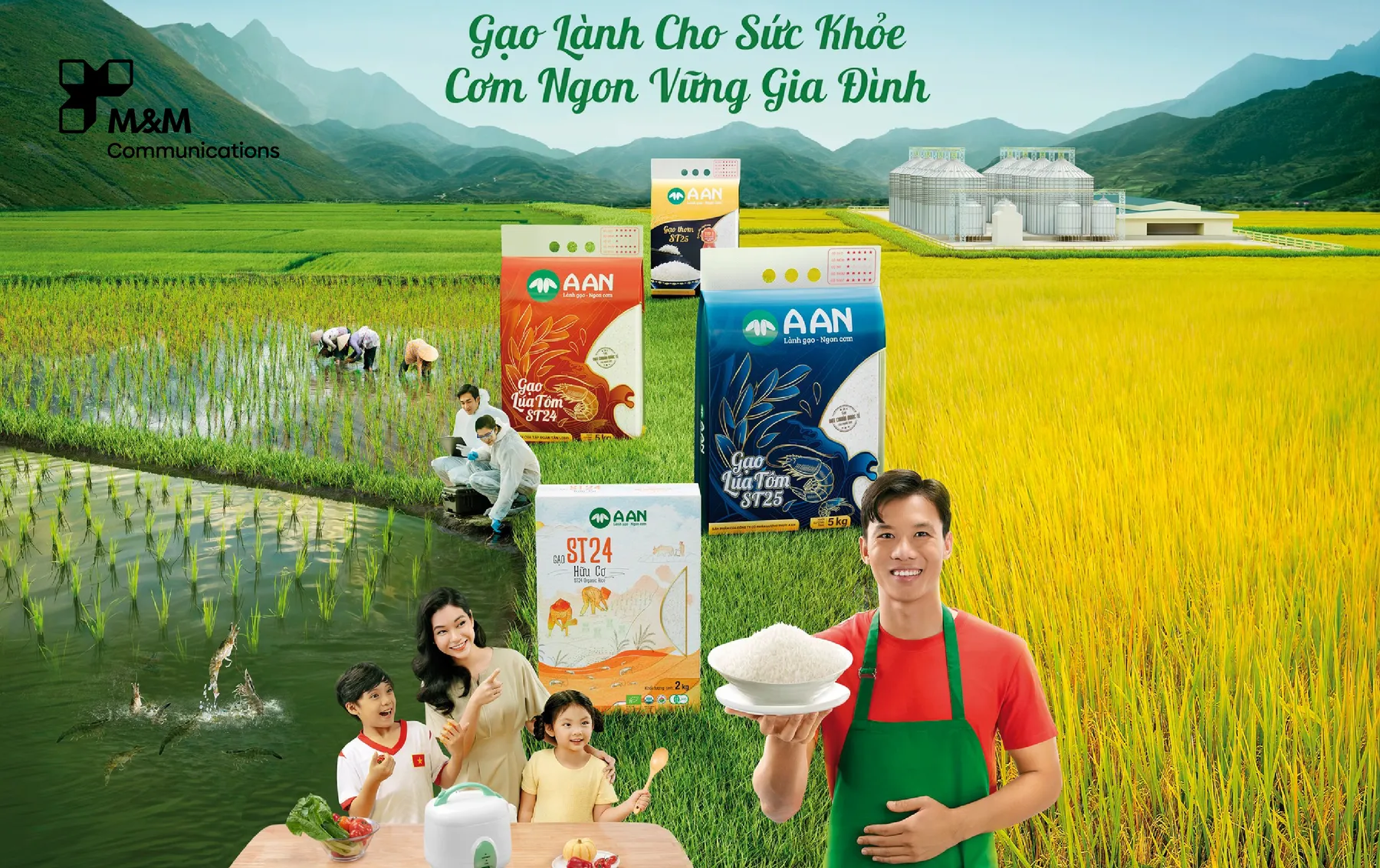
In today’s digital age, where visuals drive emotions and shape customer experience, Key Visuals (KV) play a crucial role in every marketing campaign. An effective Key Visual is not only aesthetically pleasing but also helps strengthen brand positioning, increase recognition, and deliver a consistent message across all touchpoints.
So, what makes a Key Visual truly powerful? Here are the 7 essential elements that transform a KV into a meaningful brand asset.
1. A Clear and Consistent Brand Message
A strong Key Visual begins with understanding the brand’s core message and insight:
What does the brand want to express?
What values should be highlighted?
What emotions should customers feel?
A clear message ensures the entire visual direction stays aligned and communicates effectively.
2. A Cohesive Color System
Color has a strong emotional impact and greatly enhances memorability. An effective KV should:
Follow the brand’s color palette
Use harmonious combinations with intentional highlights
Convey the right emotions: luxury, youthful, natural, energetic…
A well-designed color system strengthens brand recognition and trust.
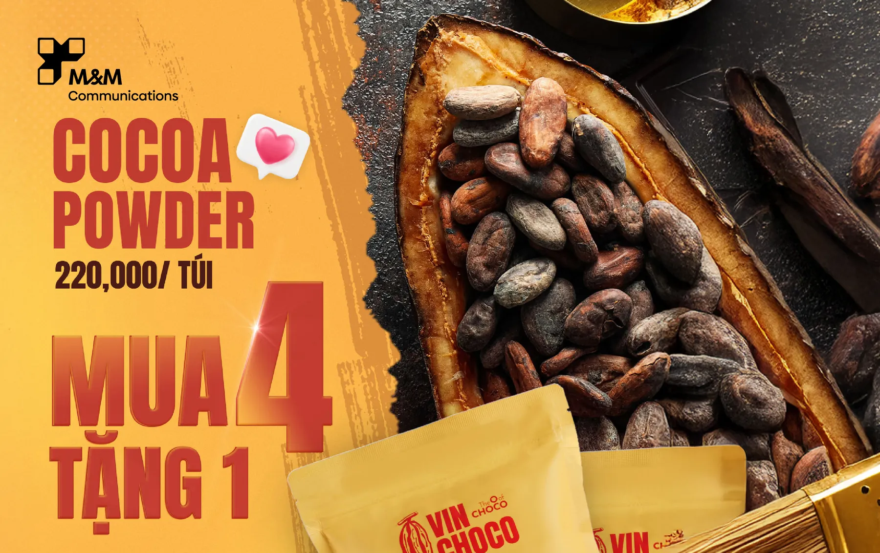
3. A Strong, Iconic Hero Visual
Every Key Visual needs a signature element that viewers remember instantly. This could be:
A standout product
A recognizable pattern or motif
A symbolic icon aligned with the message
A consistent, overarching concept
The more distinctive the hero element, the greater the campaign's impact.
>>> 5 Common Mistakes In Key Visual Design You Need To Avoid
4. High Adaptability Across Formats
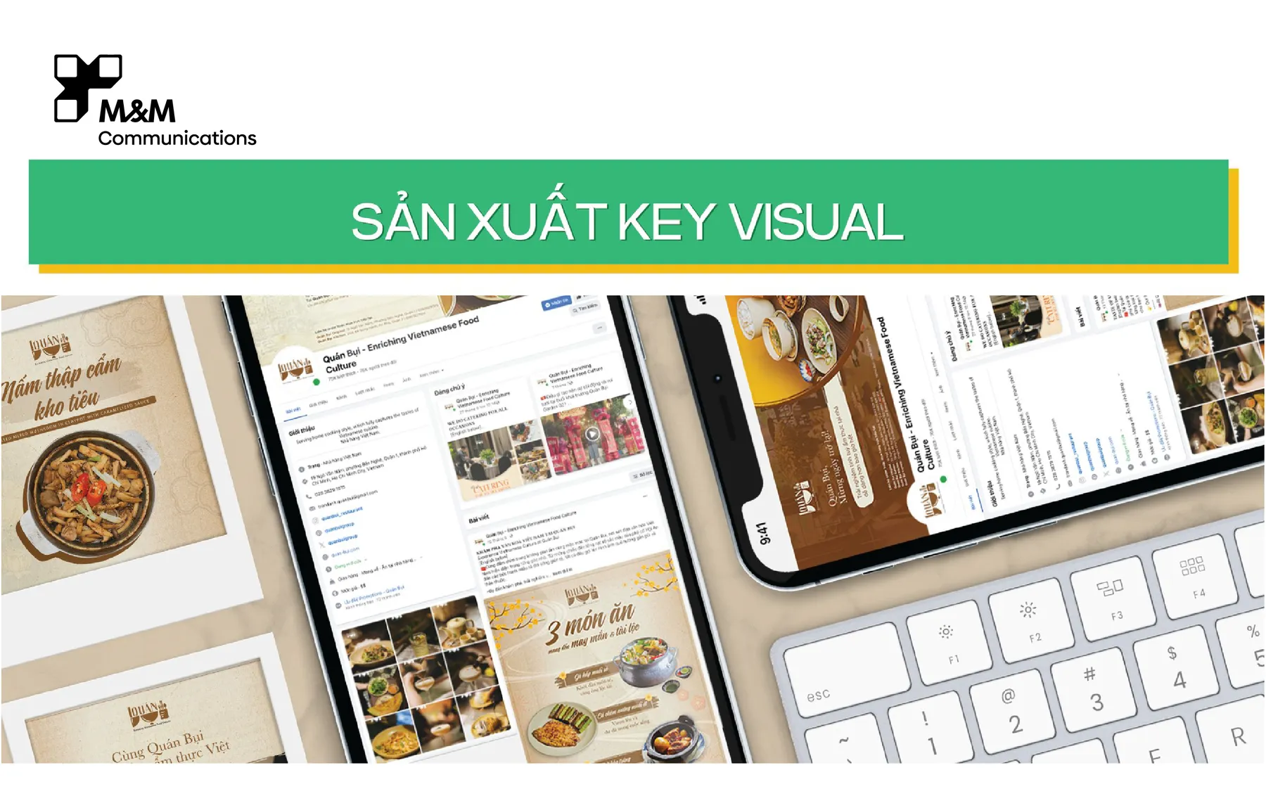
A great KV isn’t just beautiful on a poster—it must also:
Display well on digital channels (Facebook, Instagram, Ads)
Adapt to print materials (POSM, banners, standees)
Work seamlessly in motion graphics or video
Maintain layout integrity in both horizontal and vertical formats
High adaptability ensures consistent communication across platforms without losing visual identity.
5. Smart Composition That Guides the Viewer’s Eye
An effective KV should be built on a well-planned composition:
A clear focal point
Balanced spacing
Avoiding excessive clutter
With a strong layout, customers can grasp your message within the first 3 seconds.
6. Appropriate and Consistent Typography
Typography is not only about readability, but it's also about emotion. Good typography should:
Match the brand’s personality
Be legible in various sizes
Follow a clear hierarchy (headline – subhead – body)
Stay consistent throughout all materials
Strong KVs always incorporate typography that enhances the brand’s tone and clarity.
7. Uniqueness and Market Differentiation
In a saturated advertising landscape, differentiation helps brands:
Stand out from competitors
Improve memorability
Increase shareability on social media
Uniqueness may come from concept, colors, art direction, illustration style, or compositions as long as it remains aligned with the brand identity.
Conclusion
An impactful Key Visual is not just a beautiful design; it is a strategic visual system that carries the brand’s message, ensures consistency, and enhances long-term recognition and revenue.