In every communication campaign, the Key Visual (KV) acts as the “face” of the brand, the first thing audiences see and remember. A powerful KV can make a campaign go viral overnight, while a poorly designed one can cause your brand to lose credibility and emotional impact.
Yet, many brands and designers still fall into common traps when designing their Key Visuals, resulting in visuals that are beautiful but ineffective, off-brand, or confusing.
Let’s explore with M&M Communications the 5 most common Key Visual design mistakes and learn how to fix them to create visuals that truly connect with your audience.
1. Not Defining a Clear Core Message Before Designing
A Key Visual isn’t effective just because it’s “eye-catching” or “colorful.” Its main purpose is to communicate a clear message that represents the campaign’s intent.
One of the biggest mistakes brands make is starting the design process without a clear communication goal. Is the KV meant to launch a new product, promote a sale, or build brand awareness? Without clarity, the design often ends up looking good but lacking meaning, leaving the audience confused about what the brand is trying to say.
How to fix it:
Before designing, define one key message your KV must deliver.
Summarize that message into a short tagline or phrase.
Ensure every element (image, layout, and color) revolves around that message.
Example: If the campaign focuses on “energy and vitality,” choose bright tones, open compositions, and dynamic human movements that embody that feeling.
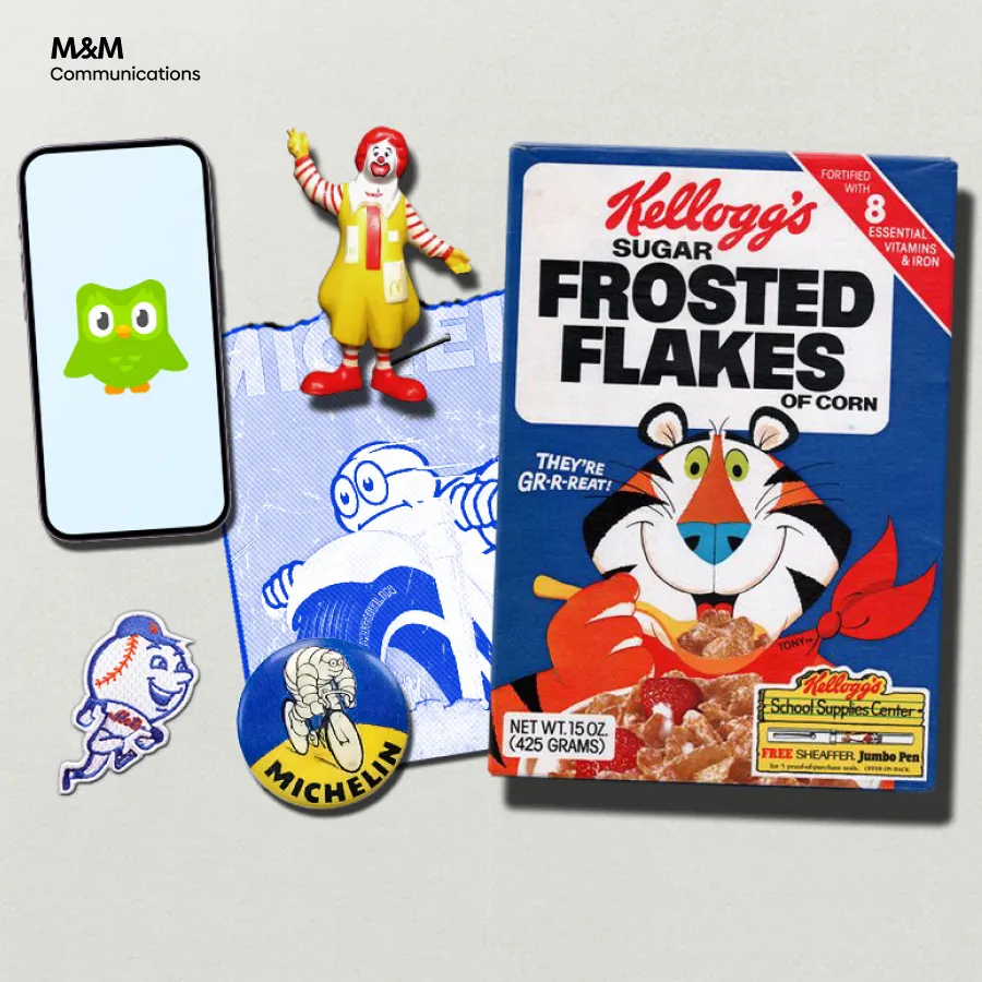
2. Overloading the Design with Too Many Elements
Another common mistake is trying to include too much information in one frame: logos, taglines, product shots, descriptions, call-to-actions, patterns, and decorative graphics.
When everything is emphasized, nothing stands out.
Remember: viewers only spend about 3–5 seconds scanning an ad image. A cluttered KV doesn’t just confuse them, it also diminishes your brand’s professionalism.
How to fix it:
Identify the focal point of your design: product, message, or character.
Apply the “less is more” principle: simplify wherever possible.
Use negative space effectively to let the main elements breathe.
A great Key Visual doesn’t overwhelm; it communicates its message clearly and instantly.
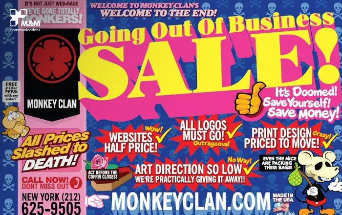
3. Ignoring Brand Guidelines
A good-looking KV means little if it doesn’t feel like it belongs to your brand.
Many designers, especially freelancers or new partners, focus on creativity but forget brand consistency, resulting in visuals that look “off-brand” even if they’re beautiful.
For example, if your brand identity is elegant and minimalist but your KV uses neon gradients and playful fonts, it creates visual dissonance and confuses your audience.
How to fix it:
Always review your Brand Guidelines before starting the design.
Maintain consistency in:
Color palette
Fonts and typography hierarchy
Logo placement
Tone and mood of imagery (warm, cool, youthful, premium, etc.)
Creativity is essential, but it should exist within the boundaries of your brand personality.
A KV that respects brand identity not only looks professional but also reinforces brand recall and trust.
4. Not Optimizing KV for Multi-Platform Use
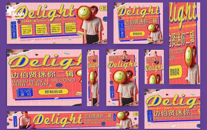
In today’s omnichannel marketing landscape, your Key Visual doesn’t live in just one format.
It appears on social media (Facebook, Instagram, TikTok), web banners, out-of-home billboards, POSM, and digital screens.
If your KV isn’t optimized for different formats, it risks losing balance, cutting off text, or making key visuals unreadable.
Example: A landscape KV designed for Facebook covers may look perfect horizontally, but when adapted to a vertical story format, the tagline or product could get cropped out.
How to fix it:
From the start, determine all platforms where the KV will appear.
Design a flexible “master layout” that can be easily adapted to various formats (square, vertical, horizontal).
Keep the core elements centered for better scalability across sizes.
A well-structured KV system not only ensures visual consistency but also saves time and cost during production.
5. Lacking Emotional Connection with the Audience
Ultimately, the most successful Key Visuals are those that evoke emotion.
A design can be technically perfect but still fail if it doesn’t evoke an emotional response in viewers.
This often happens when designers focus too much on visual polish and forget storytelling. The result? A KV that looks professional but feels cold and forgettable.
How to fix it:
Start with the question:
“What emotion should my audience feel when they see this KV?”Use human elements, lighting, color tones, and movement to create an emotional impact.
Let your KV tell a short story — simple, but emotionally resonant.
Example: Instead of just showing the product, capture the moment a person interacts with it, such as unwrapping, touching, or enjoying it. Those subtle moments make your brand feel alive and relatable.
Conclusion
A successful Key Visual is more than just a beautiful image; it’s a strategic blend of clarity, creativity, and emotion.
To recap, here are the 5 mistakes to avoid:
Designing without a clear message
Overloading visuals with too many details
Ignoring brand consistency
Failing to optimize for different media formats
Forgetting emotional storytelling
At M&M Communications, we believe every Key Visual is a form of visual language, one that speaks directly to your audience and builds authentic brand connections.
With years of experience creating integrated campaigns across industries, our creative team ensures every KV, from concept to execution, is on-brand, meaningful, and visually striking.