In today’s digital-first business landscape, branding is more than just a logo or a slogan—it is the consistency of every touchpoint that connects with your audience. Whether it’s a Facebook Fanpage post, a website banner, or a printed brochure, every piece of design contributes to shaping your brand identity.
At M&M Communications, we understand that businesses need to synchronize Fanpage, website, and print designs according to brand guidelines to create a strong and unified presence. A consistent brand identity not only builds trust but also enhances recognition, helping your company stand out in a crowded market.
This article will guide you through why synchronization is important, how to do it effectively, and the process M&M Communications applies to ensure your brand design remains consistent across all platforms.
1. WHY BRAND CONSISTENCY IS IMPORTANT
1.1 Builds Recognition and Trust
When customers see the same logo, color scheme, and typography across Fanpage, website, and printed materials, they instantly recognize your brand. Consistency reinforces memory and builds trust—making your business appear more professional and reliable.
1.2 Strengthens Brand Personality
Your brand guideline reflects who you are. By aligning all design elements, you convey a consistent message about your personality—whether it’s elegant, dynamic, youthful, or luxurious.
1.3 Enhances Marketing Efficiency
Consistent branding helps your marketing campaigns perform better. Audiences immediately associate visuals and messages with your business, reducing the need for repeated introductions and explanations.
1.4 Creates a Seamless Customer Experience
From online engagement on social media, browsing your website, to receiving a brochure or catalog, customers should experience a smooth and cohesive journey. Synchronization ensures every channel speaks the same visual and emotional language.
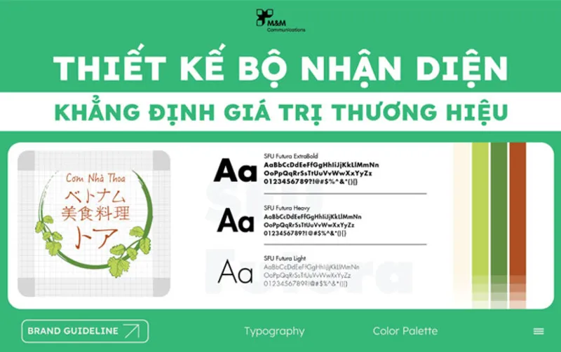
2. WHAT BRAND GUIDELINES COVER

Before discussing synchronization, let’s briefly look at what a brand guideline usually includes:
Logo usage: Variations, spacing, and restrictions
Color palette: Primary and secondary colors for digital and print
Typography: Font styles and hierarchy
Visual style: Photography, iconography, and illustration styles
Tone of voice: Messaging consistency across platforms
These elements form the foundation for designing Fanpage posts, website banners, and print materials like brochures, posters, and packaging.
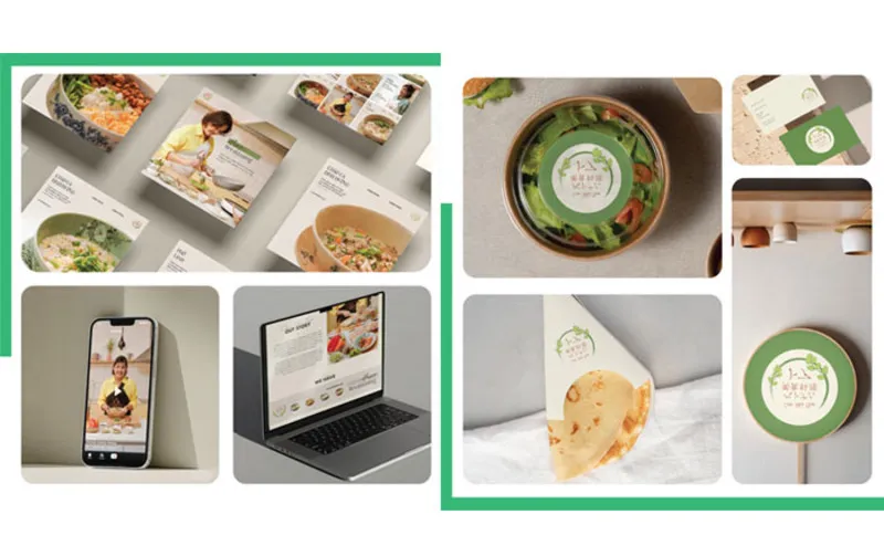
3. HOW TO SYNCHRONIZE DESIGNS ACROSS FANPAGE, WEBSITE, AND PRINT
3.1 Synchronization on Fanpage
Your Facebook Fanpage is often the first place potential customers interact with your brand. Synchronization involves:
Using profile and cover images aligned with your logo and brand colors.
Designing post templates that consistently apply fonts, layouts, and colors.
Creating ad visuals that match the same brand guideline used on your website and print materials.
3.2 Synchronization on Website
Your website acts as your digital headquarters. Consistency ensures users have a clear impression:
Banners and sliders should match the visuals from Fanpage campaigns.
Typography and colors must follow the same guideline applied in offline materials.
Icons, graphics, and photography styles should be uniform to strengthen brand recall.
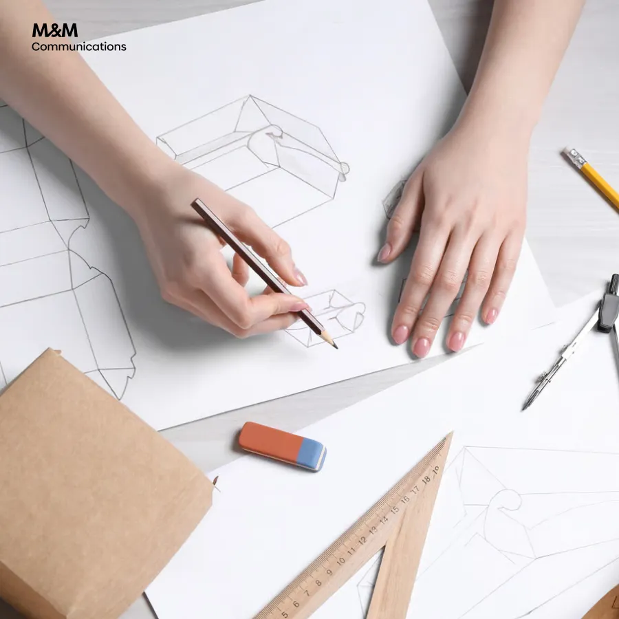
3.3 Synchronization on Print Materials
Even in a digital era, print design remains crucial for brochures, catalogs, posters, and packaging. Synchronization here means:
Printed brochures must reflect the same tone and design style as online visuals.
Typography and color codes should match digital usage (using CMYK equivalents for print).
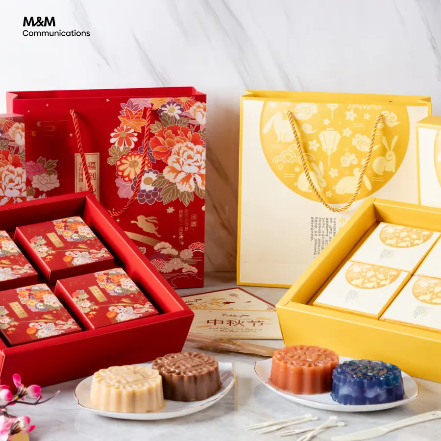
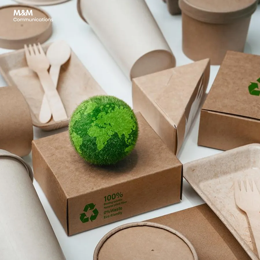
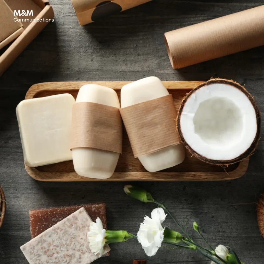
Packaging and printed ads should feel like natural extensions of online branding.
4. THE SYNCHRONIZATION PROCESS AT M&M COMMUNICATIONS
At M&M Communications, we apply a structured process to ensure brand consistency across all platforms:
Step 1: Understand Brand Guidelines
We carefully review your brand guideline (or help you build one if not available) to define logo usage, colors, typography, and tone.
Step 2: Develop a Design Framework
We create templates for Fanpage, website, and print materials, ensuring that the look and feel are harmonized from the beginning.
Step 3: Adapt for Each Channel
Each platform has unique requirements. We optimize designs so that Fanpage visuals are engaging, website banners are clear, and print materials are high-quality, while all remain consistent.
Step 4: Implement and Adjust
We test the synchronization across different media and adjust details like color calibration for print or image resolution for digital.
Step 5: Deliver & Maintain Consistency
Final designs are delivered in appropriate formats (AI, PDF, PNG, JPEG) with clear instructions for future use, ensuring long-term consistency.
5. BENEFITS OF SYNCHRONIZATION WITH M&M COMMUNICATIONS
By synchronizing Fanpage, website, and print designs with M&M Communications, you’ll achieve:
A professional and trustworthy brand image
Increased customer recognition across platforms
Cost and time efficiency by using a unified design system
A seamless marketing journey that strengthens customer relationships
6. CONCLUSION
Synchronizing Fanpage, website, and print designs according to brand guidelines is not just about aesthetics—it’s about building a consistent, reliable, and memorable brand identity.
At M&M Communications, we help businesses create and maintain this consistency through structured design processes and creative expertise. With synchronized branding, your business can confidently deliver messages that resonate with your audience—online and offline alike.
If you are looking for a partner to ensure brand consistency across Fanpage, website, and print, M&M Communications is here to make it happen.
>>> The Importance Of Synchronizing Visuals And Content In A Social Always-On Campaign