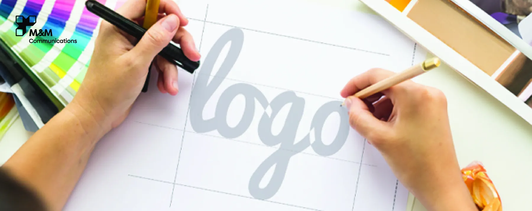
A logo is not just a visual symbol; it is the “face” of a brand, representing identity and shaping the first impression in the minds of customers. However, many businesses, especially small and medium-sized enterprises, often make mistakes during the logo design process. These errors can lead to inconsistent branding, weak recognition, or a logo that cannot be used long-term.
Below are the 5 most common mistakes in logo design and how to avoid them to build a strong, professional brand identity.
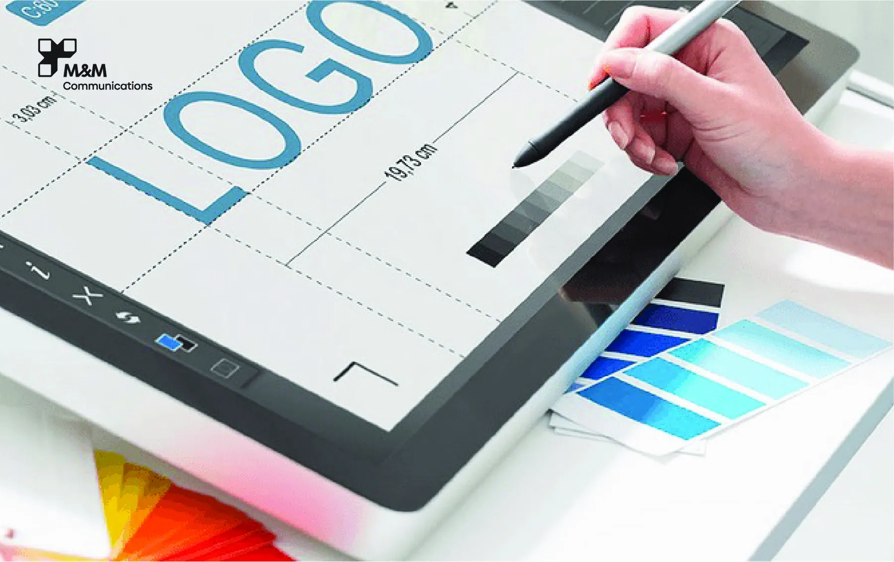
1. Overly Complex Design – Poor Scalability and Application
Many brands try to incorporate too many details to convey meaning, resulting in a cluttered logo that loses clarity when resized.
Consequences:
Hard to read when scaled down
Difficult to print on various materials
Reduced memorability
How to avoid:
Prioritize simplicity and clarity. A good logo must remain recognizable at all sizes and across all platforms.
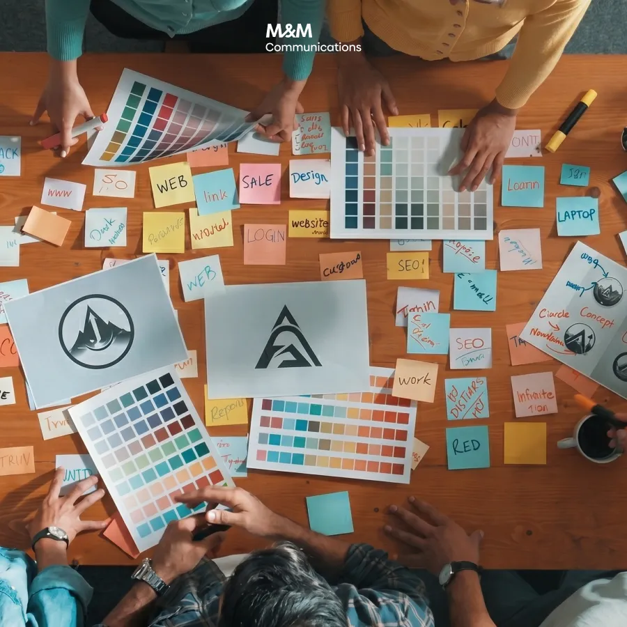
2. Lack of Market and Competitor Research
One of the biggest mistakes is designing a logo based purely on personal preference without comparing it to market standards. This often leads to duplication or weak brand differentiation.
Consequences:
Logo looks similar to competitors
Difficult to build a unique positioning
Challenges in trademark registration
How to avoid:
Conduct market research, analyze competitors, industry trends, and audience perception to ensure your logo stands out.
>>> Professional Logo Design 2025: Creating Memorable Brand Icons That Resonate
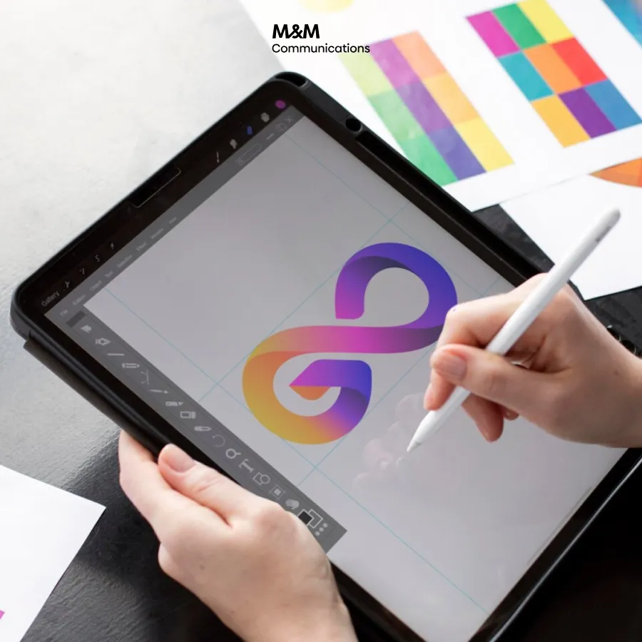
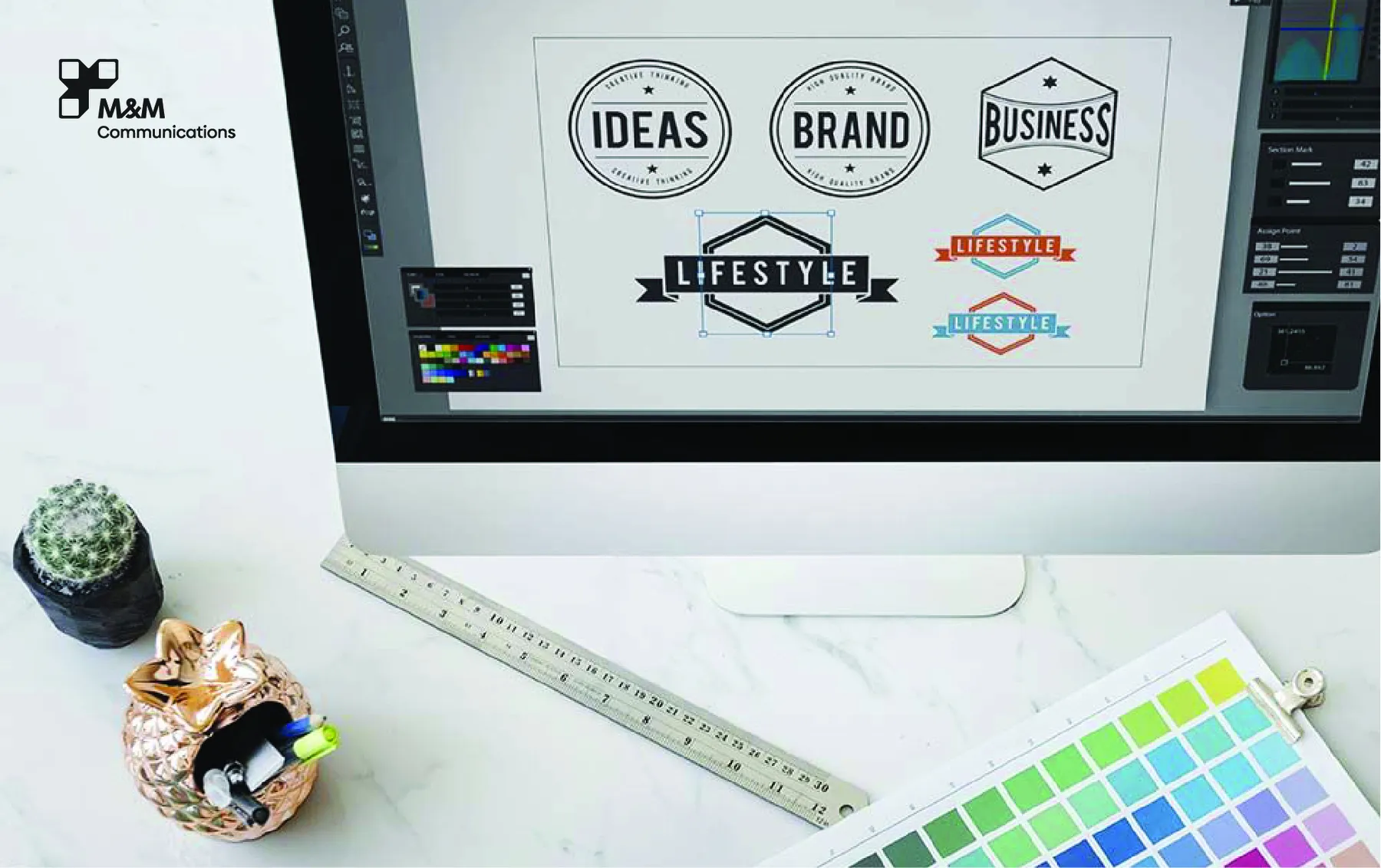
3. Using Too Many Colors
Some brands want their logo to be vibrant by adding multiple colors, but this can create visual clutter and inconsistency in the brand system.
Consequences:
Color inconsistencies in print and digital
Difficult to apply across brand materials
Less professional brand appearance
How to avoid:
Stick to 2–3 primary colors. Choose tones that reflect your brand personality and work well across platforms.
4. Inappropriate Typography – Weak Brand Identity
Typography is essential, yet often overlooked. Many logos use generic or unsuitable fonts, causing a lack of professionalism and emotional connection.
Consequences:
Reduced brand trust
Hard-to-read logo
Incorrect brand personality expression
How to avoid:
Choose a custom or carefully selected font that aligns with the brand’s tone and identity. Make sure it’s readable and balanced.
5. Designing Without Long-Term Brand Vision
Some brands design logos based on short-term trends. As the business grows, the logo becomes outdated, forcing frequent rebranding.
Consequences:
Loss of brand recognition
Costly updates to brand assets
Difficulty in maintaining consistency
How to avoid:
Design a logo with a long-term brand vision in mind. Ensure it reflects the core values, brand positioning, and future direction.
Professional Logo Design with M&M Communications
At M&M Communications, our Branding & Creative team follows a strategic and comprehensive design process to ensure every logo is both aesthetically strong and brand-centric. Our workflow includes:
In-depth market and audience research
Brand positioning and concept development
Multiple creative design directions
A cohesive brand identity system
Full file handover and brand guideline
We are committed to delivering logo designs that are unique, professional, versatile, and tailored to your brand identity.
>>> Professional Logo Design Process & Best Practices (2025 Guide For Vietnam)